If Netflix has you hooked, then it won’t take you long to get your head around the concept of smart content loading. Have you noticed that today the ads on your computer screen are selling you exactly what you were searching for yesterday? We’re moving into a world where user data is personalising our online experience, and customers are happy to hand over their details for the right results. It’s no wonder 47% of consumers check Amazon if they’re unsatisfied with the products suggested by the brand they’re shopping with – the personalised shopping experience is too good to resist. Well, now there are increasing opportunities for smaller businesses to tap in on this consumer impulse.
Smart Content refers to the dynamic elements of your website that change depending on the site user profile. Instead of being restricted to typical static content, which stays the same for everyone, smart content offers some important benefits: it targets individual customers with a personalised experience, and also increases site loading times. These things combined mean that a website with smart content loading built in will drive significantly higher conversion rates and ROI than one without.
In order to determine which tailored content to show when a unique user visits the site, smart content responds to demographic/firmographic user data (age, gender/business details) as well as behavioural (on-site activities and history) and contextual data (location, device type, time of day). This way, websites can optimise their content to increase engagement through offering visitors only the most relevant material. For example, your smart content system could tweak a landing page instantly when it knows a certain user has visited the page before, offering them a new and more relevant response the second time around. By finding out who your customers are, you can offer a friendly, personal service that keeps them coming back again and again.
Site loading speed is always a priority for engaging users. But businesses are also increasingly opting for smart content loading with the same aims of maximising page visits, time on site, and reducing bounce rates. As a development of “lazy loading”, whereby site images are only loaded when necessary, smart content loading websites limit downloads to the necessary content for a particular user, saving time by withholding unnecessary text and images.
If your potential leads have varying needs, interests, desires, or character profiles, then you should employ using smart content loading.
Some examples of the types of smart content you might create include targeted blog posts and articles, personalised calls-to-action and case studies, discounts and offers, and video content. You don’t need to go full steam ahead to begin with, but gradually segmenting the traffic to your site will enable you to make the most of your business online and keep those potential leads returning.
However, the aim is to offer a personalised, suitable experience without appearing overly familiar… no customer wants to feel like they’re being watched without remembering giving permission, so there are some things to avoid, too. For instance, unless it is a situation where the user will definitely remember their prior visit to the site, smart content loading should avoid using a user’s personal details such as their name and location.
Technology is creating amazing opportunities for small businesses online, including smart content loading. If you feel like your business is too small, or too far behind the current internet trends, you’re wrong! There’s never been a better time to join in with the excitement of web development and help your business outcompete the rest.
Get in touch for website advice, or read about more top website trends for 2021 in our blog.
If you have an e-commerce website, or utilize content marketing, Web Push Notifications could be the next step for you to keep re-engaging with your website visitors, allowing you to reach them on any device, without them needing to hand over any personal data.
We’re all familiar with regular push notifications: the banner notifications that come from the apps on your phone, such as a missed call, unread text notification, BBC news update, new match on Tinder. If you have enabled notifications for any app, that app is able to use the phones operating system to send you messages. Everyone with a smartphone knows how engaging these notifications are, grabbing your attention in real-time, with direct access to your screen no matter what you’re doing.
It is commonly believed that this type of customer-engagement marketing is limited to those who have a ‘native app’ (that is, an app that customers have to download onto their phone from the app store in order to access it’s features). However, with the efforts being made by Google and Apple to explore and move towards ‘progessive web apps’ (apps that you don’t need to download from a store, more like a website), more and more of the features of smartphone operating systems are available to improve and enhance your website or online marketing… without needing to develop a native app.
In the same way that when you install a native app on your smartphone your app asks the user for permission to access notifications features, your website can ask new visitors for approval to send them website push notifications. Once this ‘visitor’ has become a ‘subscriber’, you can then send them notifications from the website in the form of customised text, URL links, and images.
Web push notifications instantly offer some big improvements from other forms of notification marketing and native app notifications (e.g. newsletters, SMS).
You might now be wondering how to use push notifications in your marketing strategy. While the technology is not that new any more given it’s been used on every smartphone over the past 10 years, it’s introduction into a new medium (website) does mean that we can be a lot much more creative.
These are just a few of the more obvious ways to implement push notifications. But with the wealth of creative minds in our industry it is likely to be used in new and exciting ways. We have already created a push notification for a green lobbyist client, that allows them to send push notifications on their articles, but also send out real time smog warnings for affected cities or other urgent messages.
If you would like to talk more about push notifications and now it could improve your website marketing, please do not hesitate to get in touch.
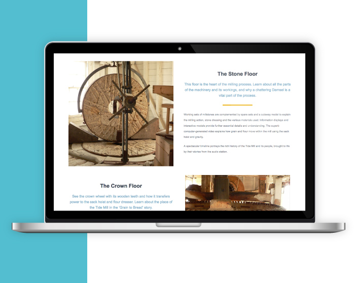
Situated on the banks of the Deben, the Woodbridge Tide Mill has been harnessing the power of the river for over 800 years. Continuing to mill to this day, it is ranked as the number 1 thing to do in Woodbridge (TripAdvisor) and required an updateable website to entice and educate potential visitors.
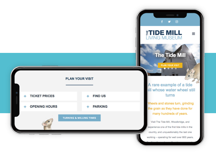
Using the existing branding we incorporated a bright and bold website, that’s easy to navigate to make sure information is quickly found. Key information is available on every page, and details such as the Tide Mill Mouse and a flowing “swoosh” sets the design of the site apart.
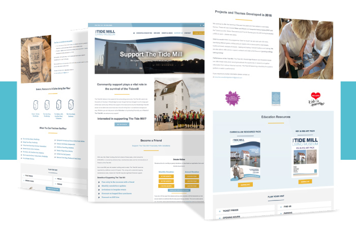
The Tide Mill is a charity and receives little state funding, so the majority of upkeep costs are provided by the community and friends. We advised on using GoCardless which allows for cost effective regular repeat donations automatically, alleviating administration and complex paperwork. The site also invites people to be a volunteer, with milling roles through to PR and fund raising positions available.
Infotex have been delighted to support the Tide Mill, and look forward to many more years of milling and turning.
Why not take a look woodbridgetidemill.org.uk
Great photography boosts website appeal in the commercial construction industry. A varied assortment of our favourites follows:
ANDERSON

Some great photography and moody atmospherics helps give the site a dramatic intrigue and a certain magnetic appeal.
BALFOUR BEATTY

A really good showcase of global projects making Balfour Beatty a powerhouse when it comes to international infrastructure operations.
BECHTEL

A superior website from one of the most respected engineering, construction and project management companies in the world. A pictorial feast of engineering wizardry.
GRAHAM

A vast array of impressive infrastructure projects throughout the UK. The showcase menu is structured well and easy to read – a nice touch with each project swapping around when scrolling across the sub headings in each category.
KIER

A fun vector graphic used as a footer showing in simplistic form of some of the services that Kier provide from construction and property development to facilities management and project investments.
MASTERSON HOLDINGS

The use of a concrete image for the background makes for a very masculine website and in the words of the Ronseal ads ‘does exactly what it says on the tin’ – after all the company are reinforced concrete and groundwork specialists.
MORGAN SINDALL GROUP

The triangular grid background of this website forms a good basis for the geometric shapes of the imagery and text panels to work together. The movement of these layers shifting independently when scrolling down gives extra appeal to the browsing experience.
RG CARTER

www.rgcarter-construction.co.uk
A straight forward layout design making the navigability very easy especially for the uninitiated.
SHERRI BUILDERS

Very professional imagery used made all the more interesting with the way that each image emerges into view giving the site a more dynamic feel.
WILLMOTT DIXON

A visual treat showing full width photography for the greater impact emphasizing WD’s commitment to being proud of their chosen industry and in particular their achievements.
If you’re interested updating your web design or digital marketing strategy, then get in touch with us today!
An app is any form of software application, most notably thought of as the tools we download on our phones and tablets to chat to friends, make bookings or play games. But it can also be the programs we use on our computers or IOT devices.
Previously an app has been something you download from an app store – Window or Apple app store, Google play (android) – or a software reseller. You need to download the right type of app for your device and make sure it is compatible with your version of software but once installed you are in its own little microcosm; with notifications, offline processing, access to the inbuilt camera, storage – it’s more secure and less likely to get hacked – and incredibly fast.
Until now mobile websites were unable to compete on this level, as they are not equipped to make use of the built in processes of a handheld device.
But it wasn’t all in Native apps’ favour. Knowing what you want and going to find an app in an app store is one thing but discovery through search engines is a powerful way to gain more visitors. Add to that the fact that a user must download, install and setup the app before they are even allowed through the door – which is known on the web as friction – it’s pretty damaging to the conversion rate of the visitors that do come.
In an attempt to combat this effect, Google decided to try and align the best elements of both web pages and applications to create Progressive Web Apps (PWA). This technology loads quickly, even on flaky networks, sends relevant push notifications, has an icon on the home screen and loads as a full screen experience.
PWA’s are still searchable on search engines but make use of the inbuilt processor. It lowers friction by allowing users to immediately get a feel for the content then gently suggesting saving the app to their home screen. It runs a ‘one size fit’s all’ when it comes to compatibility with OS and devices and does not rely on requiring each user to activate updates to their install.
One of the earliest examples of progressive web apps being adopted is Flipkart – India’s answer to Amazon and one of the country’s largest online shops – releasing Flipkart Lite. This version saw 3x more visits on a mobile than the old site and returning visits go up by 40%.
Service Workers
All of this is possible because of the development of Service Workers, which formulate the building blocks of web apps and hugely improve load time. They run as scripts working in the background of the browser or web page, opening doors to features which don’t need a web page or user interaction.
The offline capabilities of the service worker are already apparent with the push notifications you receive from various apps. However, the future lies in their ability to background cache/sync and in geofencing – a location-based mobile service that lets marketers send messages to your smartphone when you enter a defined geographic area.
Response, Animation, Idle & Load (RAIL)
It is clear that we are living in an instantaneous society where an ever-increasing speed with our technology is demanded from the public. This is where RAIL comes in. RAIL stands for Response, Animation, Idle and Load and represents the four key stages involved in the actions for your website/app. The optimisation of each of these distinct areas will reduce user frustration and retain viewers – 40% of audiences are lost if a page takes 7 seconds to load, remember that goldfish from last month’s AMP article?
Unfortunately no – well not yet…Progressive Web Apps are only available on Android devices and even then, service workers are only supported on Chrome and Opera browsers so their accessibility is hugely limited (although it is suggested that iOS devices may be supporting this technology as early as late 2016).
This is why our job as digital designers and system developers is to listen and learn from all that is out there and make sure that our work is not dependent on a new product from an internet giant, but that we heed the underlying message that users are sending out which culminates in these type of responses – two of which I have talked about here. Making sure that we offer the correct and considered advice to our clients and that our websites and applications work and continue to work optimally and inclusively for the needs of your business.
This new form of web app can be taken advantage of by most industries but one we feel is of special interest is estate agency. Many of our clients have talked about the benefits of an app, but the budget and friction of installation has generally made it prohibitive when competing against the property portals. The benefits of a web app bring the barriers of entry way down making it inviting for both estate agent and applicant. An estate agency could expect an increase in returning visitors and improved site stickiness if customers can be prompted to save the app to their mobile or tablet home screen and applicants get to just save and browse the agents they know are right for them not trawl through pages of unsuitable properties on the portals each time. Could this even be the real start of the decline in power of the portals?
The golden arches in any country gives me a craving for chocolate milkshake, a small apple with a bite taken out of it implies luxury technology and a mulberry tree makes me want to sell my husband just to get my hands on a leather bag!
The past couple of years have seen a number of brands alter their logo and 2015 saw the Infotex logo evolve and develop (more on this from our Design Director Abi Fawcus next month). But why did these companies change their already well-known brand symbol?:
1. TO ADAPT TO A CHANGING MARKET:
This year we saw the Google logo had its biggest redesign since 1999. The change was based upon how people react to Google across “many different platforms, apps and devices.”1 The typeface of the new logo is ‘product sans’ which combines “the mathematical purity of geometric forms with the childlike simplicity of schoolbook letter printing”. The renowned four colour is seen across the brand even featuring in the microphone design when using voice controls on your mobile.


Thetrainline.com has also adapted to the mobile market by changing their name to simply Trainline. They launched a new mobile app to illustrate their new brand concept of ‘Smarter Journeys’, with the CEO Clare Gilmartin stating that their “mission is to help people travel smarter, and by using their phones they can enjoy the advantages of saving money by buying in advance and ensuring they have real time travel updates during their journey.”2 The #IAmTrain campaign was also launched to promote the change with a heavy emphasis on using social media to promote the new mobile friendly brand.

2. IN RESPONSE TO A MAJOR CHANGE IN THE COMPANY:
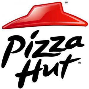
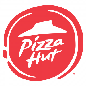
Pizzahut has recently redesigned their logo in response the their biggest menu change in years. Dubbed as the ‘Flavour of Now’ this new menu is seen as a response to their recent stagnation in the market and this logo change is used to help the transition. The Vice President of Marketing commented that “Any good flavorful pizza starts with a sauce swirl”3 which is what inspired the red swirl on the edge of the logo.
3. TO PROMOTE A NEW BRAND IDENTITY:
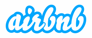
Airbnb completely changed their brand positioning in 2014 by promoting the sense that their customers can ‘belong’ in any of the properties rented through their website. They introduced their “Bélo” logo – “It’s an iconic mark for our windows, our doors, and our shared values. It’s a symbol that, like us, can belong wherever it happens to be”4

4. A BAD RESPONSE TO A LOGO DESIGN?
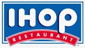
American restaurant giant IHOP (International House of Pancakes) changed their logo for the first time in decades this year. They have simplified the logo but the most major change is the red line below IHOP from a downward to an upward curve. According to the company’s Vice President of Marketing, the old logo “appeared as a person’s frown.”5 Instead he believes that the new and more positive logo will be more attractive to customers and “make them smile.”
5. FOR THE SAKE OF CHANGE?
Facebook have made very slight alterations to their logo using a custom typeface to “modernise the logo to make it feel more friendly and approachable”6 (Josh Higgins, Facebook’s creative director). The most noticeable change is the “a” which is fuller and rounder.


1 Evolving the Google Identity
2. thetrainline.com Rebrands itself to Trainline
3 Inside the Pizza Hut’s Saucy Rebranding
5 IHOP Changed its Logo, says the old one looked like a frown
6. Facebook unveils new logo in stunning change for fans of the letter A
Discover how our team can help you on your journey.
Talk to us today