
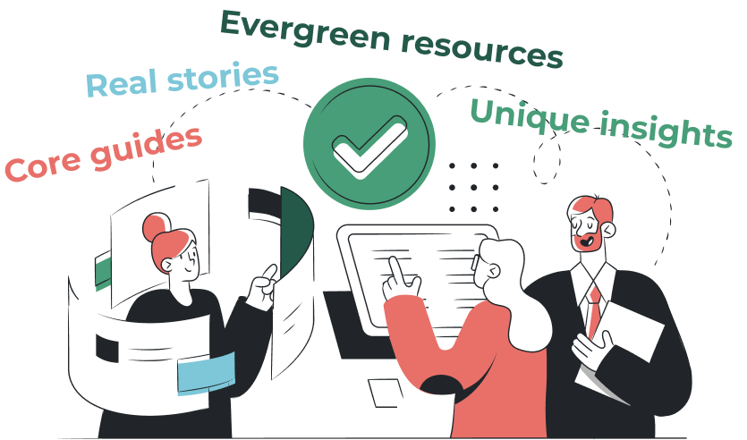
Don’t get me wrong – blog articles have their place. They’re great for SEO, they help drive traffic, and they give your brand a voice. But I’ve got a bit of a bone to pick with how we treat blogs, especially when it comes to valuable content.
Here’s the issue: a lot of really great content gets written as a blog post… and then just sits there. Buried under newer posts, forgotten in the archives, or lost in a sea of tags and categories. Meanwhile, your actual website is missing out on that value.
Let me explain…
Someone writes an amazing tutorial, a detailed explainer, a killer how-to guide, or a breakdown of your product’s best use case – and where does it go? The blog.
Six months later, that post is nowhere near the homepage, it’s not linked from any key product pages, and unless someone searches the exact right keywords, they’ll never find it.
It’s like building a beautiful new room in your house… but only giving access to it through a tiny attic door not many people use.
If you’ve got content that answers your customers’ biggest questions, shows off the power of your product, or genuinely helps people understand your space better – it shouldn’t be buried in the blog. It should live right on your main site.
These things shouldn’t be treated like throwaway blog posts. They should be structured into your site’s information architecture, linked from key pages, and presented as a permanent and valuable part of your site.
Your blog shouldn’t be a graveyard for good ideas – it should be a launchpad. Start thinking about how to elevate your best content into the main structure of your site. That could mean:
The goal is to weave content into the user journey – so visitors see it when they need it, not just if they happen to browse your blog archives.

Too often, blogs become a dumping ground for “content for content’s sake.” A checklist item. Just publish something. But when you shift your mindset and start thinking about content as a core part of your product or service – not just your blog – you change the game.
Instead of writing 50 blog posts a year and forgetting most of them, why not create 10 amazing evergreen resources and actually build them into your site?
Blog posts aren’t bad. They’re essential in many ways. But let’s stop letting our best content get buried.
Start asking: “Should this live in the blog – or should this be a core part of the site?”
If you’ve got blog content you’re proud of, that’s awesome. Now let’s make sure it’s actually working for you and your customers.
We help businesses take their best-performing, most valuable content and turn it into formats that actually guide decisions, drive engagement, and improve user experience – whether that’s a landing page, learning centre, explainer video, interactive guide, or something else entirely.
Talk to us to see how we can help turn your great content into something even more powerful – right where your customers need it most.
Make sure all pages have meta titles and meta descriptions to help search engines know what your site is about. Review the keywords/phrases that you are targeting on your site and see if they are still applicable or has terminology changed? Make sure all images have alt tags as this improves site useability for those with limited vision. The EU Accessibility Act will come in to the force this year and sets out new inclusivity regulations for sites, so if you operate in EU member states its worth reviewing where you stand.

Is your password for your website admin still Password1234, and are you using the same password for multiple different logins? The more time goes by the more advanced security risks become but the humble password is often the weakest point in the chain. Take the opportunity to get a new advanced secure password, and utilise a password manager such as LastPass or Dashlane to store those details securely. For platforms that support it make sure you have two-factor or multifactor authentication enabled.
Make sure all images have been optimised by being resized to the correct dimensions and compressed using a tool such as tinypng. This helps improve load time of the site and keeps users happy.
Are you still referencing floppy disks in your copy, have you still got the Twitter bird logo rather than X? Was your last “latest news” post from 2005? All of these reflect badly on your brand so make time to update the out of date. Time is often better served improving existing content, rather than trying to create news. While you’re there, make sure your privacy and cookie policies are all up to date.
Try going through your website and REALLY looking at it and seeing whether it still feels like it’s saying what you want it to say, in it’s look, feel, usability. Are there just a few things you need to change or is time for a complete overhaul?
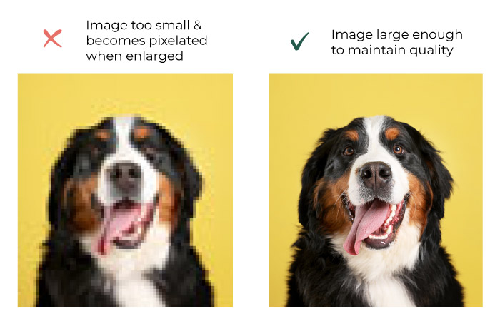
High-quality images instil trust and credibility in your company, so taking time and effort to source, create or take good photos is a vital part of any website content plan. We list some key things to look out for.
Images that are too small will become pixelated when enlarged. Make sure your source images are of a reasonable resolution – around 1000 pixels wide as a minimum. Make sure you keep the original as well, so you can always go back to it if needed.
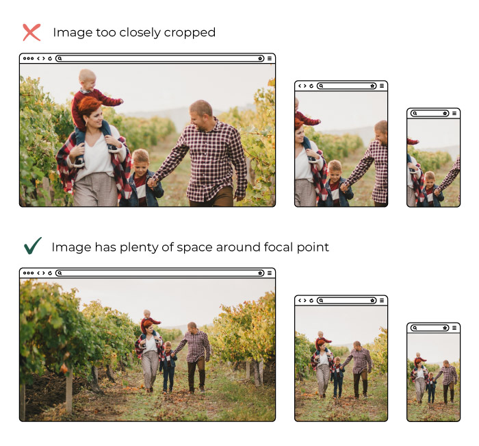
Subject matter not too closely cropped or “zoomed in”. Images on websites have to work “responsively” for each device size. This means as the site is viewed on a laptop a user can see more of an image than on a phone. If you’re cropped in too closely on a face, for example, you may find you can only see half a face on certain screen sizes. This does depend on how the site has been set up originally, but especially pertains to banner / hero photos. Because of this landscape photos are generally more useful for websites -a lot of imagery used is wider for desktop such as banner images.
We love to get high-resolution photos. It means we have the option to crop and zoom as needed. But, having large files can mean a large file size, meaning they can be slow to download for the end user. We use a variety of tools make sure they’re quick loading, from saving them in the correct format initially, resizing them prior to upload to the site, to on-site image optimisation which further compresses images without any loss of quality. If you’re loading images yourself there’s a site that can help you compress them called tinypng.com
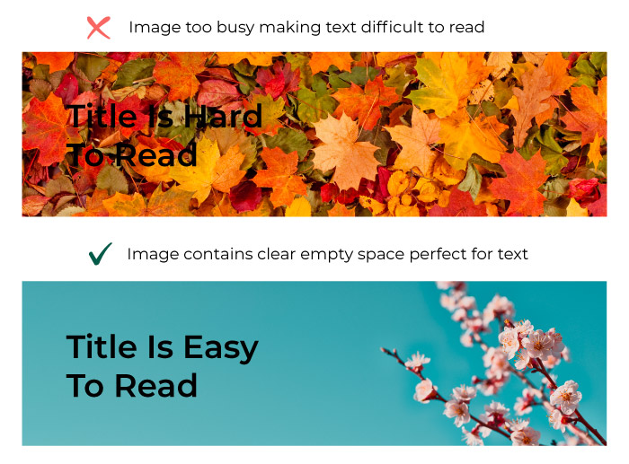
If the images are going in the background of text make sure they’re not too busy and that they’re made up of a colour that’s contrasting to the colour of the text in front otherwise the text will be difficult to read. This can be difficult to achieve, as photos are often taken with a close zoom to get the most impact, but these don’t always work well for websites.
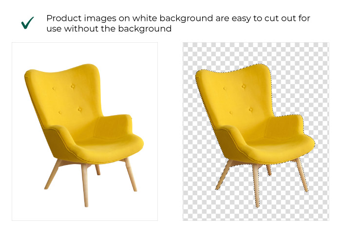
If you’re taking product imagery consider taking the photos on a white background this stops any distraction for the eye and leaves your product as the star of the show. It also allows for easy “cutting out” of the product so we can use the images overlaying other colours or images elsewhere on the site.
Make sure the photography conveys what you want it to. For instance if you want your website to show that your company is friendly and people oriented – get photographs of people interacting not only photos of your trendy office space.
Make sure you have permission to use the photography. Sadly you can’t just find any image on Google and use it on your website -you could be breaking copyright laws and receive costly fines from the right’s owner. If you don’t have your own photos to use then free resources such as Unsplash, Pexels and Pixabay have a wide choice. Alternatively, consider purchasing stock images online from sites such as Adobe Stock, Alamy or iStock.
In the last 12 months there has been a rapid rise of AI generated images, and the quality keeps improving. Sites like MidJourney, Canva and Dall-E allow you to type a prompt for what you want your image to be, and it’ll create one like magic.
If you’re not comfortable taking your own photos, then hire someone. It’s not as expensive as you may think (if you pick the right agency/ person) and a carefully planned photoshoot can be used as assets for years to come. Make sure you know what you want out of any photo shoot though, and speak to your web developer about what ratio photos should be so your hero banners, product photos and / or team shots are the very best they can be.
Before our developers start on the complicated business of building your website, there are a couple of steps in the creative process we like to go through first.
Our designers will create wireframes of your new website, and once you’re happy with them they’ll create visuals too. But what are wireframes and visuals, and why do we create them?

Wireframes are like a floorplan of a house only for a website. They don’t show you exactly what the finished product will look like but they show you what’s included and how it’s laid out. They’ll normally be sent to you as a link to a set of flat images that you can view online.
Wireframes share similarities with how a floorplan of a house looks too: they’re normally pretty basic, in black and white with boxes and shapes to show where different elements will go. Wireframes will show things like where an image or a button will go but it won’t include an actual image or the colour or styling of the button.
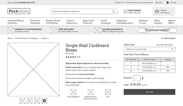
Example of a product page wireframe for an ecommerce website.
We create wireframes to show you a visual representation of how your website will be structured. It helps to understand the user journeys and the UX (user experience) throughout the site. We want to make sure you’re happy with the content included and how it’s laid out before we get to work on styling it up.
Once we’ve done wireframes and we know you’re happy with the content structure and layout of your site, we move on to visuals. This is where we start applying your brand to the design. Visuals are created to give you an idea of how the website will actually look and feel. They’re still just flat images, usually sent via a link – not a working website that you can click through.
Visuals will look and feel like the real thing with a few small differences. Visuals will include your branding, colouring, and imagery but they may not always use all of your content. We often use something called ‘Lorem Ipsum’, which is a form of placeholder text, until your copy is ready. This means you can see what your website will look like filled with text without having to have all your copy ready at this point. Often the visuals can actually help you in the process of writing your copy, too, as they give you an idea of where text is needed and how much.
This can also be the case for imagery. We may use stock photographs as placeholders to give you an idea of the sort of photo you might want if you haven’t had your photography done yet.
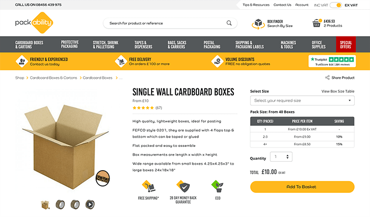
The final visual for an ecommerce product page
We want to make sure you’re happy with the look and style of your website before we pass it to the developers to build the working site for you. If there’s something you dislike or want to add, we can work that out together before the building process begins. Then the developers can be sure they’re building your site exactly how you want it.
As mentioned before, visuals can also help to guide you in how much content you want to write and what kind of photography you want (if you don’t already know). Visuals can also help as a reference point between you and us while you share your content with us ready for the finished website.
Obviously wireframes and visuals are two very different things but we do them both for the same reasons: to save on wasted time and mistakes, to help communicate with you on your website requirements and how we’re interpreting them, and to make sure we deliver you the exact website that you want and need.
Put simply, web accessibility means ensuring that websites or mobile apps are usable by as many people as possible. This includes those with vision or hearing impairments, motor difficulties, and cognitive impairments or learning disabilities.
Accessibility also refers to making websites and apps usable for people with more situational limitations, such as people using mobile phones, older people, people in locations where they cannot play sound, people with ‘temporary disabilities’ such as injuries or lost glasses, or people with socio-economic limitations such as slow Internet connection.
Accessibility is important for ensuring that everyone has equal access to information online. It aims to remove barriers for users with disabilities and impairments who might otherwise struggle to access online content. Around twenty percent of the UK population have a long term illness, impairment or disability.
Accessibility is particularly important for public sector websites and apps, because they often provide essential services that everyone must be able to access.
On top of this, making your website or app accessible is beneficial to every user. Accessible websites are often faster, clearer, have better user journeys, and could rank higher on search engine results.
All public sector bodies have to meet the accessibility regulations that came into force in 2018, unless they are exempt or partially exempt (such as schools).
These requirements outline the need for websites and apps to be ‘perceivable, operable, understandable, and robust’ for as many people as possible.
Non-public sector organisations and businesses are not required by law to reach these same accessibility standards for their websites. However, there are numerous benefits of making websites as accessible as possible:
There are many ways to make your website accessible, some are more simple than others.
For a thorough look at what can be done, designers and developers refer to the Web Content Accessibility Guidelines (WCAG). It is usually more effective to incorporate accessibility from the start of a project, rather than returning to re-do work.
If these guidelines seem a lot to take in… hear from one of our designers, Alice, for simple ways to make your website accessible.
Got questions about the accessibility of your website or app? Don’t hesitate to get in touch.
Our recent launch of the new website for the Children’s Commissioner had to meet the WCAG AA Standard. The website audience is diverse, aimed at children and young people as well as teachers, parents and the media. Combining three priority areas identified by the Commissioner into one comprehensive website, it was vital that all of the detailed reports, articles and publications are easy to read and view across multiple devices, platforms and screen readers.
We worked with Suffolk County Council to create a new website promoting Suffolk as the ‘Greenest County’. With a wealth of content (totaling over 300 pages), the website needed to meet accessibility guidelines to ensure that everyone is able to read about their inspirational work. Check out their website: greensuffolk.org
April 27 is International Design Day. To celebrate, here’s a little look into the history of web design.
Design is (and always has been) all around us, in the built and digital environments we occupy. Digital design – including web design – is a particularly dynamic force, a place where design intersects with business, art, education, AI, music, – you name it.
Good web design can make information accessible, bring people to the services they need, inform the world, and improve business performance.
In the late 1980s the world wide web was first recognised when physicist Tim Berners-Lee created the software to create what we now know as web pages.
This 80s era of text-only interfaces, designed on black screens with coloured pixels, is sometimes known as the dark ages…
The 1990s saw huge changes in the world of web. In 1990, three university students launched what is thought to be the first-ever search engine, Archie. This was closely followed by the World Wide Web browser for editing web pages (subsequently named Nexus), also created by Berners-Lee.
Notable on the design front was the introduction of Adobe Photoshop 1.0. The full image editing application was released for the Macintosh system (6.0.3) for editing images that had been scanned onto a computer.
In 1991, Berners-Lee and his team created the first-ever website. Web designers became able to create content both horizontally and vertically, albeit on text-only pages. In an historic moment following this, Berners-Lee’s team uploaded a photo of parody pop group Les Horribles Cernettes, which became the very first photo on the internet.
In November 1995 – shortly after the introduction of Amazon.com, Internet Explorer and Auction Web (now eBay) – HTML 2.0 specification was published, which supported forms, tables, graphics, and a number of new tags, such as, <head>, <body>, <form>, <img>, <strong> and others.
Following this, JavaScript 1.0 was designed by Brendan Eich of Netscape, paving the way for creation of interactive websites. In 1997 the Web Accessibility Initiative (WAI) officially launched, working to develop standards and provide support materials to help web developers to create accessible sites.
Google arrived on the scene in 1998. Its stark white home page, with a solitary logo and a single search box was a huge step away from the densely populated Yahoo! and AskJeeves home pages of the time.
Web designs were progressing and Adobe ImageReady 1.0 was released – a graphics editor including the ability to create rollover effects or short animations (GIF). Cascading Style Sheets (CSS) software was created in 1996, which allowed the content (HTML) to be separated from the visual elements such as layout, colour, and font).
The blogging platform Blogger.com rode a successful wave at the turn of the century and in 2003 WordPress was introduced as a blogging software. At the time, it simply enabled users to create simple blog posts with very little visual personalization, but this led the way to the popularity of personal blog-led websites.
Mobile phones were catalysts for the ‘flat design’ revolution. The depth and 3D effects of websites were removed to suit smaller screens.
From this came Responsive Web Design, which enables website content to be displayed to suit relevant resolution or screen size. This is a trend we are still riding and has become an essential part of web design.
This was the birth of many tools that we still use today. The Sketch app (although we did not use it then) is now our go to choice for designing websites. The Bootstrap framework was originally developed to help maintain HTML/CSS and JavaScript code consistency in Twitter applications, but like many agencies and web designers we adopted the framework to help in most of our websites and again still use it today for some of our site builds. In 2012 media queries were introduced this allowed us as web designers to get really creative as they allow for adaptable web page rendering based on various factors such as screen resolution or size.
We are beginning to see the use of AI come into the web world and we can only imagine where this is going lead too and how it could even change the way we work. We also believe that web design as we know it today could become very different in the upcoming years, as websites are getting more and more powerful for businesses and users. Even though it’s changing rapidly, the fundamentals of web design and what we love to do still stay strong.
Everyone has their own idea of what the future will look like… but in the fast-moving digital world, the future is never far away. We’ve asked some of our team what their predictions are for the coming year. Do you agree?
The word ‘metaverse’ was runner up for the Oxford University Press Word of the Year 2022 – a telling sign of the growing conversation around a future where digital and physical worlds merge. Contributing to this future is the growing traction of Augmented Reality (AR), a type of Extended Reality (XR) that is on the rise along with Virtual Reality (VR) and others.

Note, for instance, the new World Cup FIFA+ Stadium Experience, an augmented reality overlay that allows stadium audiences to view stats, heatmaps, insights, and VAR replays on their phones while they watch the match live. This is just one of many examples of AR, a technology that brings together digital data and the physical world and is predicted to reach a global market of $50 billion by 2024. While technology is usually implemented on mobile apps – such as Amazon’s View in Your Room feature or the Ikea Place app – it is starting to be implemented on websites too, such as knitted tie store Broni and Bo’s virtual try on. AR might prove to be particularly beneficial to business owners from sectors such as beauty, manufacturing and tourism.
Amidst the online constant buzz of activity, brands and platforms alike are battling to create meaningful and memorable user experiences. Motion is one of the ways that your brand’s website can stand out and hold on to user attention. Implemented well, a user experience including motion can communicate a story, sequence, or transition more effectively than one without.
Interfaces that include motion do not have to rely on plugins but can be integrated through development frameworks. Enhancing your website and brand through Motion UI doesn’t have to mean animation or videos – additions as simple as the motion micro-interactions that occur when a user hovers over an action point or clicks a transition button can make the difference between a static website and one that ignites a user’s interest. Take a look at the Motion UI on our own website, for example.

As the internet grows and changes, the popularity of voice search continues to rise through Amazon Alexa style devices and “Hey Siri” requests. And, with the increasing popularity of Internet of Things (IoT) devices, such as smart speakers, this trend doesn’t show any signs of decline. This is not a trend to ignore: optimising your business for voice search will help with every aspect of your overall SEO. Click here to find out more about what steps to take for voice search optimisation.
You may not realise, but many websites that you visit are actually using PWA technologies to provide an experience closer to that of native applications. You can see this when you visit sites like Twitter, Gmail, etc.
Progressive web apps are essentially web applications that feel and function like a native mobile application. This means they increase the quality of user-experience by offering advantages such as offline use, hardware access, push notifications, and the ability to be “installed” on the user’s device. While these clever web apps have been on the increase for a while, their popularity shows no sign of slowing down. Click here to read more about progressive web apps.
Single Page Applications (SPAs) are a key cause of our constant scrolling habits. SPAs work inside a browser to offer seamless user-experience by dynamically loading as a single page. This way the user does not have to wait for the site to continually reload, and can enjoy uninterrupted scrolling. They can offer better page performance, data protection, and work efficiently if the user has poor internet connection, as the content loads completely at the first sign of communication with the server.
Single-page websites (SPWs) work in much the same way. Website content, such as that which might otherwise be found under a “Work” or “About” tab, is fully loaded on the initial page and can be navigated by links within the one page. These intuitive and well-structured single-page websites increase the likelihood of maintaining the attention of users, and enable control of the order in which information is absorbed. Compared to multi-page sites, the site design and development requires less time and money and is more suited to optimisation for mobile devices.
Smart Content refers to the dynamic elements of your website that change depending on the site user profile. It targets individual customers with a personalised experience, and also decreases site loading times to drive significantly higher conversion rates and ROI. Read more about Smart content loading in our blog.

The green transition is here, and, with the internet as a major producer of carbon emissions, web developers have an important role to play. From sustainable web design, to efficient web development, to green hosting, there are many things website creators can and should be doing where possible. As awareness grows about the need for online business that cares for people and planet, and creative solutions increase, we expect sustainable web development practices to continue to grow.
One of the less sexy elements, but for any company that has ever experienced a cyber attack first-hand, online security has always been extremely important.
During 2022 we saw an increase in large-scale nation-state cyber-attacks, such as the Russian attacks against Ukraine and Montenegro and the unidentified attack on the New Zealand government. In 2023 businesses should expect attacks of this kind and scale to become more common and sophisticated. Some of the more pessimistic members of our team would not be surprised to a government body or key public services (or comparable body) is brought down due to a cyber attack.
These security concerns are not just reserved for large corporations. In 2022 research by the world economic forum found that 95% of cyber security issues were caused by human error or a lack of cyber security concerns. Website and Web applications process a lot of valuable data, and with more company assets moving to the cloud to accommodate hybrid/remote working, the potential damage caused by cyber-attacks has never been higher.
Many of the trends we see for 2023 are very similar to those we saw in 2022. Will 2023 be the year that web3 finally kicks off? or the year that there is a considerable push on hardware that supports ARs, making it an essential part of our daily lives? Only time will tell!
One thing is certain. However, companies that provide clients and customers with the best user experience will thrive in 2023. There is a lot of new exciting technology out there that is easy to get excited about, but there is no magic bean this year that will separate the pack. Companies that take the time to understand their customers and demographics and tailor their website and online marketing to utilise the above tools (motion UI, smart content, PWAs, AR etc) correctly will come out on top.
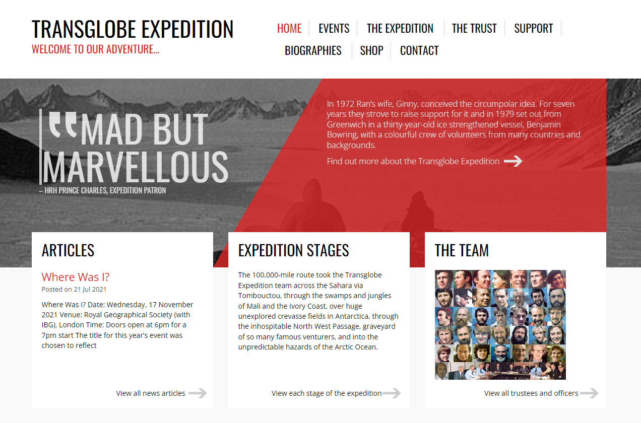
A new feature-length documentary “Explorer” hits cinema screens this month, looking at the life of adventurer Sir Ranulph Fiennes. Kicked out of the SAS, he has since been crowned as the “World’s Greatest Living Explorer” and dubbed “gloriously and refreshingly mad” by Prince Charles.
Infotex have been involved with Fiennes’ projects for over a decade. We created the Transglobe Expedition website, which hosts an archive of material relating to his journey to circumnavigate the globe. Rather than the more traditional east–west route around the equator, Fiennes’ team travelled north-south via the Sahara Desert, the Northwest Passage and snowmobiling across both poles – including a break to play cricket at the South Pole.
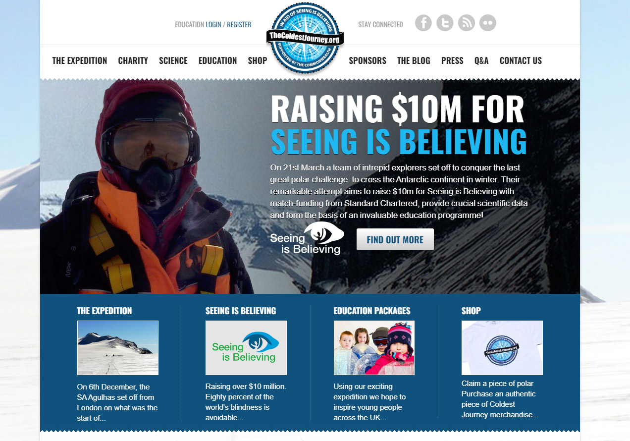
In 2013 we were invited to create a site for The Coldest Journey. This expedition had the aim of being the first team to ever cross the Antarctic during a polar winter, where temperatures can go as low as -70C. Unfortunately, Fiennes had to pull out early in the project after suffering frostbite, but the team went on to raise over $10 million for Seeing is Believing, a global initiative to tackle avoidable blindness. The website had clear donate buttons, a live tracker to follow the team’s progress across the ice and a login area for schools to access educational material.
It’s well known that Fiennes has a rule to never pay anybody for anything at any time in relation to his adventures, and, yes, this does extend to the websites we’ve produced. Still, we’re proud to have supported his projects over the years, and look forward to seeing Explorer soon.
Watch the trailer below.
Amongst recent trends in brand development, logo redesign seems to be making the biggest mark… Burger King, Pfizer, Warner Bros, Cadbury’s, and BMW are just a handful of the big names who’ve opted for a refresh in the last year.
A logo is at the heart of a brand identity – it communicates the values and quality of a product or service, but most importantly, it allows customers to build a strong association with your brand. The popular move now is to upgrade to simplified, flat-design logos that work across many platforms.
Some companies, of course, never need to change their logos too drastically (think Nike and Spotify). But for others, there’s pressure to keep modernising your logo to freshen your brand.
What does your logo say about your company? Is it suitable across multiple technologies? And when might it need a refresh?
Online criticism of the minimalist logo trend, however, is enough to make us think carefully before changing our brand identities too drastically for no reason.
Still, we’ve put together some thoughts about when you might consider that logo facelift, and how to ensure it’s one that continues to accurately communicate your motives and values in an expressive way.
The tendency toward simplification in the evolution of logos is somewhat inevitable. Minimal logo designs are generally easier to digest, and the quicker a logo can get into the mind of a consumer and stay there, the better. They are easily recognizable and memorable, approachable, and highly user-friendly.
Simple, flat logos continue to be hugely effective in translating brand identity to audiences across a range of physical and digital media. What’s more, as some brands become such a prevalent part of our lives, even assimilating into our grammar (to google, to uber), their logos don’t need to hold as much information – we already know the brand promise.
There is a risk when changing a logo, though, that the association people have with your brand might be damaged. Mastercard had to undertake two years of social research before changing to a wordless logo, to ensure people would still recognise it.
There has been backlash to what’s been termed “oversimplification” amongst the logo redesign trend, with a sense that the minimalist, digital-friendly logos we’re seeing are too basic and lose character.

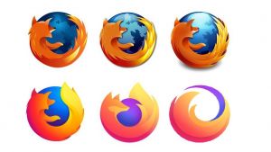
One YouTube trend took off under the title, “Please, don’t turn me into an oversimplified logo!” in response to redesigns like that of Pringles.
Early this year, Firefox minimalist logo memes spread widely, with great sadness that “they killed the fox”, after Firefox introduced what in fact turned out to be a parent brand logo. The fox is very much still alive on the browser icon.
We’ve established why it might not be the best idea to go for a logo refresh for no particular reason, because you’re at risk of losing the essence of your brand. However, there are times it is necessary to think about an update… we suggest taking these key points into consideration…
Your logo no longer just needs to look good in a storefront or brochure. It needs to be as clear and impressionable on a small phone screen as it does on a billboard. Many companies are opting for flat, colourful designs to work across all platforms.

Has your target audience changed? If so, you might need to change too. Instagram’s successful logo upgrade from the previous camera icon came about because, as their head of design Ian Spalter said, it “was beginning to feel…not reflective of the community.” Keeping your logo up to date shows you are listening to your audience.
When something’s broken… fix it.
Sometimes a logo just isn’t cutting it. Two years ago, Slack announced that their original logo proved “absolutely awful”, because, consisting of 11 different colours, it was near impossible to place on top of colourful backgrounds. Their new one keeps the same core spirit of the original, but is more practically refined.
Whether it’s a merger, acquisition, or simple repositioning of brand motives, your logo should grow and change as your brand does.
In 2008, Infotex merged with Shelton Internet, traders with a focus on back end technical development. We wanted to represent who we were as a new team, and the excellent technical capabilities that came with it, so we weaved the characteristic capital letters of the old Shelton Internet logo into our old “infotex” logo and brand name.
At Infotex we’re always on the look out for those important moments when a brand refresh might be necessary. In fact, keep your eyes peeled for some upcoming changes to our brand look…
We are always seeing exciting new trends explode in the design world. Perhaps it won’t be long before flat design logos give way to designs using neumorphism and glassmorhpism.
Whatever happens, you only have to look at, say, Apple, or Instagram, to know that good logo redesign can work wonders. But make sure you’re budding for that refresh for the right reasons.
If Netflix has you hooked, then it won’t take you long to get your head around the concept of smart content loading. Have you noticed that today the ads on your computer screen are selling you exactly what you were searching for yesterday? We’re moving into a world where user data is personalising our online experience, and customers are happy to hand over their details for the right results. It’s no wonder 47% of consumers check Amazon if they’re unsatisfied with the products suggested by the brand they’re shopping with – the personalised shopping experience is too good to resist. Well, now there are increasing opportunities for smaller businesses to tap in on this consumer impulse.
Smart Content refers to the dynamic elements of your website that change depending on the site user profile. Instead of being restricted to typical static content, which stays the same for everyone, smart content offers some important benefits: it targets individual customers with a personalised experience, and also increases site loading times. These things combined mean that a website with smart content loading built in will drive significantly higher conversion rates and ROI than one without.
In order to determine which tailored content to show when a unique user visits the site, smart content responds to demographic/firmographic user data (age, gender/business details) as well as behavioural (on-site activities and history) and contextual data (location, device type, time of day). This way, websites can optimise their content to increase engagement through offering visitors only the most relevant material. For example, your smart content system could tweak a landing page instantly when it knows a certain user has visited the page before, offering them a new and more relevant response the second time around. By finding out who your customers are, you can offer a friendly, personal service that keeps them coming back again and again.
Site loading speed is always a priority for engaging users. But businesses are also increasingly opting for smart content loading with the same aims of maximising page visits, time on site, and reducing bounce rates. As a development of “lazy loading”, whereby site images are only loaded when necessary, smart content loading websites limit downloads to the necessary content for a particular user, saving time by withholding unnecessary text and images.
If your potential leads have varying needs, interests, desires, or character profiles, then you should employ using smart content loading.
Some examples of the types of smart content you might create include targeted blog posts and articles, personalised calls-to-action and case studies, discounts and offers, and video content. You don’t need to go full steam ahead to begin with, but gradually segmenting the traffic to your site will enable you to make the most of your business online and keep those potential leads returning.
However, the aim is to offer a personalised, suitable experience without appearing overly familiar… no customer wants to feel like they’re being watched without remembering giving permission, so there are some things to avoid, too. For instance, unless it is a situation where the user will definitely remember their prior visit to the site, smart content loading should avoid using a user’s personal details such as their name and location.
Technology is creating amazing opportunities for small businesses online, including smart content loading. If you feel like your business is too small, or too far behind the current internet trends, you’re wrong! There’s never been a better time to join in with the excitement of web development and help your business outcompete the rest.
Get in touch for website advice, or read about more top website trends for 2021 in our blog.
If any of you have ever looked into improving your website accessibility and are anything like me (a compulsive perfectionist and worrier), you may find it all seems a little overwhelming. The “Web Content Accessibility Guidelines” (WCAG) consists of SEVERAL pages of complicated-looking legal text – but fear not, you don’t need a law degree to make some simple improvements!
After being tasked with sharpening up my accessibility skills for an upcoming client project, and getting over the feeling of impending doom brought on by the terrifying WCAG table of contents, I turned to Infotex’s resident fountain of all knowledge, Infrastructure Manager & Developer, John Harman:
“It doesn’t have to be complicated – there are plenty of simple things you can do.”
And he was right. He found me an hour-long online course, where they broke down some easy steps to take to make websites more accessible. I’ll share some of the best bits with you now…
People with colour blindness struggle with seeing the differences between different colours. If you stick to one colour, and just use different shades or opacities of that colour, users should be able to see the contrast between the shading.
If you have any lines that are important for the website’s usability, try making them a few pixels thicker so they’re easier to see.
Often, for instance, you’ll see red used to show that there’s been an error of some kind. It’s fine for you to do this, but someone with colour blindness may miss out on your meaning. So when you do use colour for meaning, make sure you always couple it with a symbol or explanatory text of some kind.
If you haven’t got enough contrast between your background colour and font colour, you could be making it very difficult for some people to read your text. Try using a simple online colour contrast checker like contrastchecker.online to check your contrast is up to scratch.
Target areas are basically areas that are clickable, like buttons. It’s advised to make them 44px x 44px minimum.
To make your imagery more accessible for those with vision impairment, add alt text to your images. This way users can utilise technology such as screen readers to hear descriptions of the images you’ve included.
As a general rule, more readable sans serif fonts are a good choice, I ended up choosing Montserrat for my project but here’s some other ones the course suggested: Helvetica, Arial, Futura, Gill Sans, Verdana, Avenir, Franklin Gothic, Frutiger.
A minimum of 16px font size is an easy rule to stick by.
For line height they suggest setting it to at least 1.5 x the font size you’re working with. For Letter Spacing they suggest setting it to at least 0.12 x the font size you’re working with.
As a designer I would say this is a rule you should follow in life anyway, but definitely try and avoid justifying your text if you’re trying to make it accessible, it’s just so much harder to read!
These are just some of many simple steps you can take to make your website more accessible – but remember, every little positive change you make helps!
Websites are constantly evolving; like all modern technology, they don’t sit still for very long. While some evolutions are more subtle, as through sophisticated CRO campaigns designed to increase page conversions rates, some are more monumental, sparked by a shift in devices or the way we use the internet.
These larger changes to web design tend to follow a cultural shift which changes the way in which business can communicate with consumers. The most obvious example of one of these changes was the introduction of the ‘smartphone’ and the shift to mobile ‘responsive’ website designs.
The next big cultural shift that will impact web design is no doubt the one we are living through now; the impact of COVID 19 on the world has seen a change in the way in which many of us work and interact with our computers. The results of working from home have been surprising, revealing even to the most old school companies that often employees can thrive and be more efficient if given a longer leash. This has in all likelihood accelerated the timeline, with the expectation that a lot of will have adopted flexible working patterns within the next 12-18 months, like the anticipated two-day in office, three-day remote, working week. With this kind of large scale change to the way in which we work, we should expect our computers and other products to pick on all of the new ‘pain points’ of flexible working and make modifications.
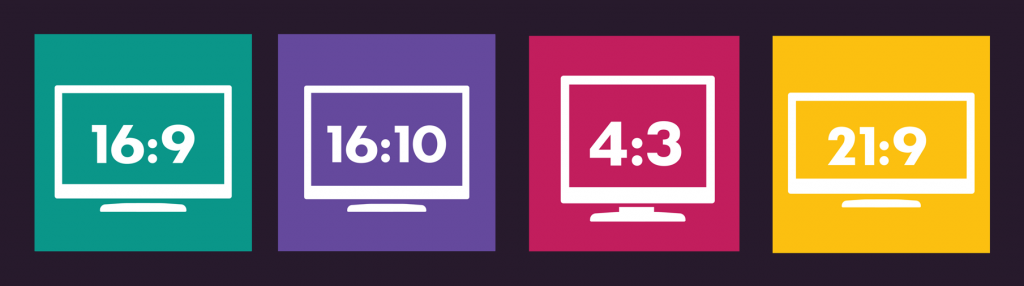
The need for laptops to be more productive on-the-go, away from the traditional ‘work station’, has already led to a visible shift in the world of laptops and computers, with the design of higher end 2020 models from Dell and Apple being made more proactive for ‘work’ rather than ‘play’. The most notable trend is the change in screen dimensions; the ‘envelope’, ideal for movies and photographs, is being steadily replaced by a ‘squarer’ design that allows for programs like Word and Excel to make better use of the screen. Dell’s new range of XPS laptops have adopted a taller 16:10 ratio rather than the traditional 16:9. Apple seems to be following suit, and for a few years now they have been very much pushing their iPad devices as realistic alternatives to high end laptops, boasting the more productive 4:3 ratio screens. And with rumours of a bezel-less design refresh coming to their entire iMac and Macbook 2020/2021 range, we should expect them to follow suit.
A new screen ratio is potentially an exciting evolution for website designs, particularly for companies operating in the B2B markets and other industries that see the majority of their traffic come via ‘desktop’ devices. The prospect of a taller, squarer website will allow for a much more marketing real estate on customers screens. We could see the end of cinematic designs that use fill screen imagery and minimum text, or we might see a step back to old school website designs trends that fight to get as many key messages ‘above the fold’ to ensure users see them on first landing.
Regardless of the trends we might see, this change in screen ratio illustrates the ever changing nature of marketing online and that clever thinking is needed to use the tools available at our disposal. At Infotex, when talking to clients who rely on desktop traffic, we always make sure that we take a closer look to the exact screen dimensions from the previous website’s stats. It has resulted in many successful websites that are designed with the clients marketing objectives and their specific customers’ user experience in mind.
Discover how our team can help you on your journey.
Talk to us today