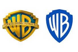
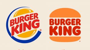
Amongst recent trends in brand development, logo redesign seems to be making the biggest mark… Burger King, Pfizer, Warner Bros, Cadbury’s, and BMW are just a handful of the big names who’ve opted for a refresh in the last year.
A logo is at the heart of a brand identity – it communicates the values and quality of a product or service, but most importantly, it allows customers to build a strong association with your brand. The popular move now is to upgrade to simplified, flat-design logos that work across many platforms.
Some companies, of course, never need to change their logos too drastically (think Nike and Spotify). But for others, there’s pressure to keep modernising your logo to freshen your brand.
What does your logo say about your company? Is it suitable across multiple technologies? And when might it need a refresh?
Online criticism of the minimalist logo trend, however, is enough to make us think carefully before changing our brand identities too drastically for no reason.
Still, we’ve put together some thoughts about when you might consider that logo facelift, and how to ensure it’s one that continues to accurately communicate your motives and values in an expressive way.
Are simple logos better?
The tendency toward simplification in the evolution of logos is somewhat inevitable. Minimal logo designs are generally easier to digest, and the quicker a logo can get into the mind of a consumer and stay there, the better. They are easily recognizable and memorable, approachable, and highly user-friendly.
Simple, flat logos continue to be hugely effective in translating brand identity to audiences across a range of physical and digital media. What’s more, as some brands become such a prevalent part of our lives, even assimilating into our grammar (to google, to uber), their logos don’t need to hold as much information – we already know the brand promise.
There is a risk when changing a logo, though, that the association people have with your brand might be damaged. Mastercard had to undertake two years of social research before changing to a wordless logo, to ensure people would still recognise it.
Is there such a thing as Oversimplification?
There has been backlash to what’s been termed “oversimplification” amongst the logo redesign trend, with a sense that the minimalist, digital-friendly logos we’re seeing are too basic and lose character.
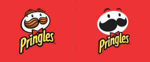
One YouTube trend took off under the title, “Please, don’t turn me into an oversimplified logo!” in response to redesigns like that of Pringles.
Early this year, Firefox minimalist logo memes spread widely, with great sadness that “they killed the fox”, after Firefox introduced what in fact turned out to be a parent brand logo. The fox is very much still alive on the browser icon.
So, when should you update your logo, and why?
We’ve established why it might not be the best idea to go for a logo refresh for no particular reason, because you’re at risk of losing the essence of your brand. However, there are times it is necessary to think about an update… we suggest taking these key points into consideration…
To maintain a highly responsive design
Your logo no longer just needs to look good in a storefront or brochure. It needs to be as clear and impressionable on a small phone screen as it does on a billboard. Many companies are opting for flat, colourful designs to work across all platforms.
To respond to your target audience

Has your target audience changed? If so, you might need to change too. Instagram’s successful logo upgrade from the previous camera icon came about because, as their head of design Ian Spalter said, it “was beginning to feel…not reflective of the community.” Keeping your logo up to date shows you are listening to your audience.
When your logo just isn’t good enough
When something’s broken… fix it.
Sometimes a logo just isn’t cutting it. Two years ago, Slack announced that their original logo proved “absolutely awful”, because, consisting of 11 different colours, it was near impossible to place on top of colourful backgrounds. Their new one keeps the same core spirit of the original, but is more practically refined.
To reflect change
Whether it’s a merger, acquisition, or simple repositioning of brand motives, your logo should grow and change as your brand does.
In 2008, Infotex merged with Shelton Internet, traders with a focus on back end technical development. We wanted to represent who we were as a new team, and the excellent technical capabilities that came with it, so we weaved the characteristic capital letters of the old Shelton Internet logo into our old “infotex” logo and brand name.
At Infotex we’re always on the look out for those important moments when a brand refresh might be necessary. In fact, keep your eyes peeled for some upcoming changes to our brand look…
Is there a future for logo design beyond the current trend?
We are always seeing exciting new trends explode in the design world. Perhaps it won’t be long before flat design logos give way to designs using neumorphism and glassmorhpism.
Whatever happens, you only have to look at, say, Apple, or Instagram, to know that good logo redesign can work wonders. But make sure you’re budding for that refresh for the right reasons.