Websites are constantly evolving; like all modern technology, they don’t sit still for very long. While some evolutions are more subtle, as through sophisticated CRO campaigns designed to increase page conversions rates, some are more monumental, sparked by a shift in devices or the way we use the internet.
These larger changes to web design tend to follow a cultural shift which changes the way in which business can communicate with consumers. The most obvious example of one of these changes was the introduction of the ‘smartphone’ and the shift to mobile ‘responsive’ website designs.
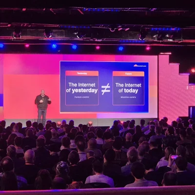
The next big cultural shift that will impact web design is no doubt the one we are living through now; the impact of COVID 19 on the world has seen a change in the way in which many of us work and interact with our computers. The results of working from home have been surprising, revealing even to the most old school companies that often employees can thrive and be more efficient if given a longer leash. This has in all likelihood accelerated the timeline, with the expectation that a lot of will have adopted flexible working patterns within the next 12-18 months, like the anticipated two-day in office, three-day remote, working week. With this kind of large scale change to the way in which we work, we should expect our computers and other products to pick on all of the new ‘pain points’ of flexible working and make modifications.
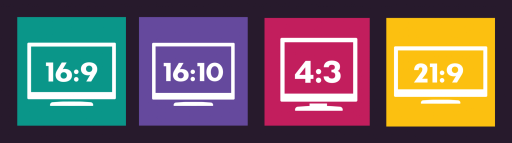
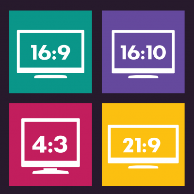
The need for laptops to be more productive on-the-go, away from the traditional ‘work station’, has already led to a visible shift in the world of laptops and computers, with the design of higher end 2020 models from Dell and Apple being made more proactive for ‘work’ rather than ‘play’. The most notable trend is the change in screen dimensions; the ‘envelope’, ideal for movies and photographs, is being steadily replaced by a ‘squarer’ design that allows for programs like Word and Excel to make better use of the screen. Dell’s new range of XPS laptops have adopted a taller 16:10 ratio rather than the traditional 16:9. Apple seems to be following suit, and for a few years now they have been very much pushing their iPad devices as realistic alternatives to high end laptops, boasting the more productive 4:3 ratio screens. And with rumours of a bezel-less design refresh coming to their entire iMac and Macbook 2020/2021 range, we should expect them to follow suit.
A new screen ratio is potentially an exciting evolution for website designs, particularly for companies operating in the B2B markets and other industries that see the majority of their traffic come via ‘desktop’ devices. The prospect of a taller, squarer website will allow for a much more marketing real estate on customers screens. We could see the end of cinematic designs that use fill screen imagery and minimum text, or we might see a step back to old school website designs trends that fight to get as many key messages ‘above the fold’ to ensure users see them on first landing.
Regardless of the trends we might see, this change in screen ratio illustrates the ever changing nature of marketing online and that clever thinking is needed to use the tools available at our disposal. At Infotex, when talking to clients who rely on desktop traffic, we always make sure that we take a closer look to the exact screen dimensions from the previous website’s stats. It has resulted in many successful websites that are designed with the clients marketing objectives and their specific customers’ user experience in mind.