
Last Updated July 2023
It is estimated that data centres contribute 2% of all global greenhouse gas emissions – a figure that is rising as digital demand increases. However, by utilising cloud-based services for our hosting we are sharing resources and facilities, which reduces the number of duplicate, energy-hungry single-use servers.
We are conscious that site hosting will have an impact on Infotex’s carbon footprint. Because of this we are always looking to make sure our technical partners have, or are, taking steps towards sustainability. Our monitoring systems also help us to ensure that we are using these resources efficiently.
For the hosting of our primary websites and systems we use three main providers: Rackspace, Amazon Web Services (AWS) and ionmart.
Rackspace’s approach to the environment is straight-forward: they aspire to give back more than they take from the planet.
In 2019, Rackspace reviewed its energy strategy and opted to focus resources and efforts on energy reduction instead of purchasing carbon offsets.
Rackspace’s UK data centres LON3 and LON5 run on 100% renewable energy. Data centre LON8 does not, though Rackspace publishes an Environmental, Social and Governance Report (2021) showing steps they are taking to be net-zero across all sites by 2045.
Their commitment to a greener business isn’t just limited to energy. They have a host of creative ways to minimise waste in offices, such as composting coffee grounds and shipping pallets, refurbishing retired IT equipment for aftermarket use, collecting HVAC condensate to maintain landscaping and operate cooling towers.
As part of their route to net zero, they have been publishing a greenhouse gas emissions inventory every year since 2008, covering their global operations.
For further details visit Rackspace’s Corporate Responsibility section of their site.

Amazon Web Services (AWS) is targeting their global operations to be powered by renewable energy by 2025. The London and Ireland based AWS (where we host our sites and systems) are currently powered by 95% renewable energy.
In 2019 Amazon launched the UK’s largest wind Corporate Power Purchase Agreement, located in Kintyre Peninsula, Scotland. The new wind farm is expected to produce 168,000 MWh of clean energy annually – enough to power 46,000 UK homes every year.
Amazon provides a Customer Carbon Footprint Tool which allows us to monitor our own carbon emissions and how those would compare to running on-premise computing equivalents – cloud computing can be 80% more efficient in this respect.
For further details visit Amazon’s Sustainability in the Cloud section of their site.
It’s not only carbon emissions that AWS monitor, but their water stewardship programme aims to be water positive (that is returning more water to communities than they use) by 2030.
All of iomart’s data centres are powered by 100% renewable energy. They continuously evaluate sites to continue to reduce emissions, such as looking at how waste heat can be turned back into usable power. This project won them the ‘Best Use of Emerging Technology’ from the Digital City Awards in March 2022.
In 2022 iomart developed a Carbon Roadmap to help understand their Scope 1 and 2 GHG emissions, and set carbon reduction targets. They also comply with ISO50001 Energy Management to reduce energy usage.
Further details can be found on iomart’s Environmental, Social & Governance page.
This is a topic which started over 10 years ago and is led by the USA’s Cybersecurity & Infrastructure Security Agency (CISA) and is shared with the European Cyber Security Month (ESCM).
While the topic may seem ethereal and mired in complicated titles, the principle behind it is very simple and one which every business should take time this month to consider if you haven’t already.
October is a month when many businesses start to focus on the busy period ahead and getting the basics in place before that rush could save you valuable time later on so here are some thoughts and actionable tips.
Cyber Security starts with the simplest of things, which hopefully everyone reading this knows and implements already:
Infotex have gone through the accreditation process, and while we had a good security understanding beforehand this has helped focus everyone’s attention on the issue.
Phishing is when a fraudulent email is sent to you asking you to take some action believing the email originated from someone else you know. This is one of the biggest threats to any organisation today with almost a quarter of breaches in the Verizon Data Breach Report 2022 started via a phishing attack.
It is believed that around 3% of all phishing emails successfully entice their viewer to click the link. The emails are often very convincing using a combination of familiarity, based on information colleagues have posted about themselves online (sometimes unwittingly), and also a sense of urgency. It is always worth taking that moment to check because clicking a fraudulent link could be the start of a chain of events you’ll never forget.
Phishing doesn’t just happen via email. Text messages and phone calls are also becoming more common targets for phishing attackers as awareness of email phishing rises.
Ransomware is designed to prevent you from getting access to the files on your computer by encrypting them. You are then invited to pay a ransom to unlock the files.
It is generally recommended not to pay ransoms as you can’t be sure that the attacker will fulfil their side of the deal. You’re also funding organised crime and encouraging future attacks. It is better to invest in good protection and well-protected, external backups that are not directly connected to any device. Ensuring your computing devices and programs are up-to-date and have good antivirus software installed costs very little but offers a lot of protection, also maintain a good policy on keeping the operating system and software patches up to date, such as Windows Updates, finally if you run as a limited user rather than an administrator that often reduces the damage an attacker can inflict.
Within Cyber Security the term “capture the flag” is an exercise whereby one team set out to obtain some item of data held by another team within the business. If they are able to obtain it then both teams stop, learn how it happened and agree on steps that can be taken to ensure that a genuine attacker could not do so, thus increasing the overall security of the organisation.
You don’t need formal “red & blue teams” to do this, even the smallest of businesses can benefit from trying this, perhaps start by seeing whether one staff member can find the login password (or passphrase) for another member of staff’s computer. is it on a post-it attached to their monitor, is it the name of their child / cat / favourite holiday destination? Do they leave their PC logged in while they take their lunch break allowing anyone to walk up-to and use the PC in their absence?
The aim of Capture The Flag is not to belittle anyone but rather for everyone to learn from the experience and collectively improve your defences.
These are just a few of our thoughts, there’s much more advice available online as well as events in both the virtual and physical world but now you’ve read this article do ask yourself whether even that advice is genuine or is someone trying to get information out of you?
Cookies are a well-known topic of concern for internet data security. Yet we find ourselves interacting with them every day – mindlessly accepting the cookie banners on websites we visit as we go about browning the internet. Does it matter?
Here’s everything you need to know about the pros and cons of cookies and how to be mindful of them.
Cookies are small snippets of data created by websites when you visit and browse them. They were first invented in the mid-1990s by a developer for the browser Netscape, as a way to inform the browser if a user had previously visited a particular website.
Cookies sometimes provide essential roles for websites, such as by remembering the items saved in your shopping basket on an ecommerce website until you check out.
Other times, cookies are used by advertising companies to retain data about your browsing habits and target ads to you across your browser. Ever wondered how you are targeted over and over with ads for something you once viewed?
The uses of cookies can be categorised into three broad purposes:
Functional, whereby cookies inform the server of past website activity by this specific user. For instance, when you log in to a site, a cookie maintains your shopping basket as you jump between pages.
Personalisation means that cookies help a browser remember the activity or preferences of a user. When the user revisits the website, the experience can be tailored to them (such as by remembering your chosen light/dark colour scheme).
Tracking cookies record user activity to be used for advertising or analytics purposes either to show information customised to you or to present that information back on behalf of the site’s owner.
Session cookies
These store user information during one specific site visit, and are deleted either when the browser is closed or after a period of inactivity. Commonly these are used to store confirmation of whether you are logged in or not.
First-party cookies
These come directly from the website you are visiting, and the information contained is restricted to that site. They will remain in your browser between visits, for example when you click “remember me” on a login panel to show your email when you return.
These are generally malign provided the website you are browsing is trustworthy and uncompromised. To aid this, the site owner can indeed mark these to only be accessible over a secure connection by their web server and not by scripts running in your browser.
Third-party cookies
Third-party cookies are those that come from companies external to the website you are browsing, one such example is an image served by an advertiser, these are often used to track your behaviour, providing targeted ads to multiple sites you visit and they can have long lifespans of a year or more. One of the most common third-party cookies on the web is Google Analytics.
Supercookies
Known by several names such as Zombie Cookies or EverCookies. These use combinations including all of the above and more such as browser “local storage” or specially crafted cache entries to recreate user information and tracking profiles even when regular cookies have been cleared from your browser. These are almost always used to track user behaviour such as for advertising purposes and can be extremely difficult to fully remove.
Generally, cookies are safe. They can only store a limited amount of data and unlike programmed information, cookies cannot easily be hacked or used to install viruses on a computer. However, an insecure cookie – one that is communicated unencrypted or intercepted via third-party scripting on a site – can be a potential security risk for visitors or operators of the origin website. With cookies providing simple information, though, the risk is rarely of high concern.
Instead, the concern most associated with cookies is the privacy of personal data and tracking.
Cookies can be used to allow advertisers to store information about your browsing habits to provide targeted ads that follow you around the web.
But, supposedly, this cannot happen without you knowing about it… laws such as the GDPR, the ePrivacy Directive and the Data Protection Act 2018 mean that operators of sites using cookies have to ask for your informed consent to gather data except where that data is needed for the core site functionality. That’s why there are so many banners online now, asking for your agreement. But often we just click “accept all” without thinking twice…
While cookies are generally safe, it is a good idea to know that it is not difficult to control them.
Your browsers preferences or settings will allow you to :
Many browsers will also let you browse in private or ‘incognito’ mode, prohibiting your browsing history or cookies to be stored or indeed allow you to clear the cookies on a per-site basis.
There are also browser add-ons you can use to control the use of cookies on your browser, such as the Google Analytics Opt-out Browser Add-on which is available for all the main browsers.
Some modern privacy centric browsers now offer ‘state partitioning’ – a fancy way of assigning third-party cookies to the site you were viewing when they were set. That way the adverts on a site remain with that site rather than follow you around the web despite the tracking companies best efforts to do so.
Browser manufacturers know that third-party cookies have obtained a poor reputation due to the tracking mis-use outlined above. In 2021 Google announced that their market leading Chrome browser will cease support for third-party cookies in 2024. They are however also piloting new technologies to replace it called FLoC and its successor Topics. These are intended to be ways for advertisers to obtain a generic profile of the site viewer which is shared with many other individuals worldwide, allowing relevant adverts to be shown based upon the type of site viewed recently; typically they last 3 weeks, while not allowing the advertisers to identify the viewer individually.
Google’s recently introduced Analytics product GA4 is specifically designed so that it can be event based and work without cookies, unlike previous versions.
We are delighted to announce Infotex have been accepted into the Crown Commercial Digital Outcomes 6 framework, which will be live later this year.
Crown Commercial Service supports the public sector to achieve maximum commercial value when procuring goods and services.
Acceptance onto the framework allows local government and healthcare organisations access to services provided by Infotex. Our ambition is to work more closely with a wider range of organisations in order to design, build, improve and support the back-end systems that sit within healthcare and government to produce better outcomes for all.
Frameworks are agreements between the government and suppliers to supply certain types of services under specific terms. Infotex Ltd have been accepted to provide:
As a digital outcomes supplier, we must:
Jonathan Smith, Director of Infotex Healthcare Systems commented “We are delighted to be accepted onto the framework. It gives us greater opportunity to support the NHS and wider services using our experience in the development of the systems we are already delivering into the care sector”.
“This additional platform reflects the hard work and dedication of our team to really deliver systems in the right way, to the right audience. We can continue to support healthcare teams and patients on the path to better digital assessment and care which is so important.”
Most recently, the team launched a digital self referral platform that allows the smooth and carefully managed assessment of podiatry patients which decreased our client’s 800+ patient backlog to manageable levels within just a few weeks.
Take a look at a review by Dr Hinkes of this system.
In 2019/20, CCS helped the public sector to achieve commercial benefits worth over £1bn – supporting world-class public services that offer best value for taxpayers.
For further information about Infotex’s health systems get in touch.
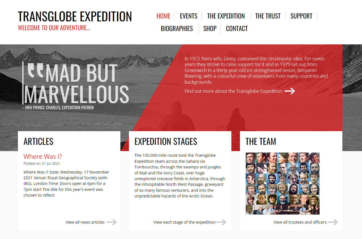
A new feature-length documentary “Explorer” hits cinema screens this month, looking at the life of adventurer Sir Ranulph Fiennes. Kicked out of the SAS, he has since been crowned as the “World’s Greatest Living Explorer” and dubbed “gloriously and refreshingly mad” by Prince Charles.
Infotex have been involved with Fiennes’ projects for over a decade. We created the Transglobe Expedition website, which hosts an archive of material relating to his journey to circumnavigate the globe. Rather than the more traditional east–west route around the equator, Fiennes’ team travelled north-south via the Sahara Desert, the Northwest Passage and snowmobiling across both poles – including a break to play cricket at the South Pole.
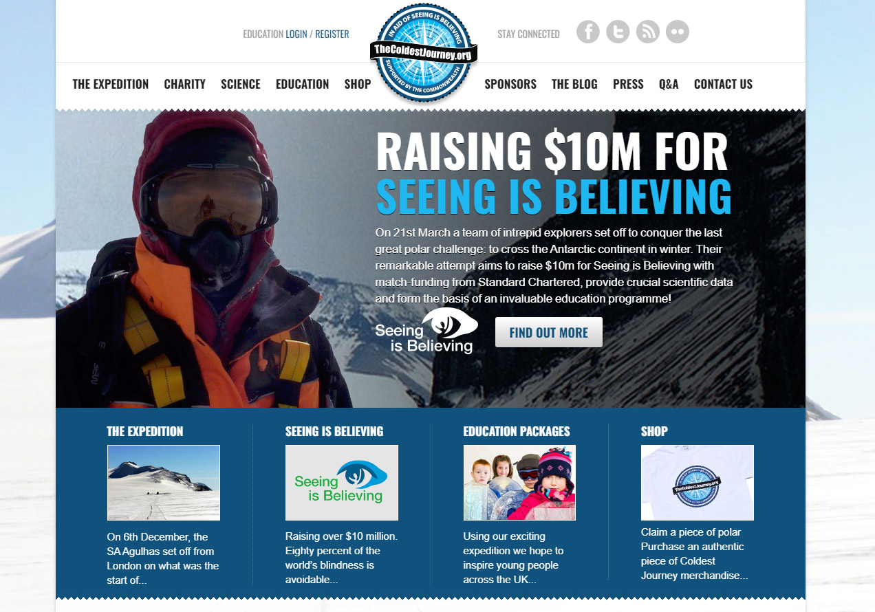
In 2013 we were invited to create a site for The Coldest Journey. This expedition had the aim of being the first team to ever cross the Antarctic during a polar winter, where temperatures can go as low as -70C. Unfortunately, Fiennes had to pull out early in the project after suffering frostbite, but the team went on to raise over $10 million for Seeing is Believing, a global initiative to tackle avoidable blindness. The website had clear donate buttons, a live tracker to follow the team’s progress across the ice and a login area for schools to access educational material.
It’s well known that Fiennes has a rule to never pay anybody for anything at any time in relation to his adventures, and, yes, this does extend to the websites we’ve produced. Still, we’re proud to have supported his projects over the years, and look forward to seeing Explorer soon.
Watch the trailer below.
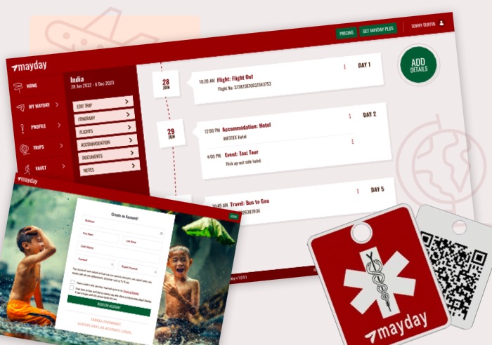
Perhaps you’re finishing university and intending to take a gap year (or two) to travel the world. Maybe you’re taking your family on their first holiday abroad or simply heading off with friends for a well-earned holiday. Whatever the reason, the challenge of storing your travel documents securely, whilst ensuring you have access to everything you need in an emergency is vital. That’s where Mayday comes in.
Mayday is a web portal that can be accessed via a physical QR-coded tag, which can be worn as a bracelet, necklace, or simply as a keychain on a bag. Mayday offers vital support in a range of situations, including:
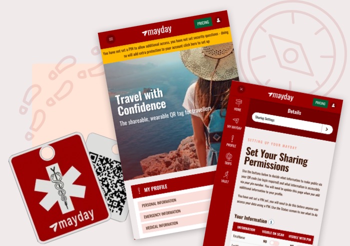
User experience and security were at the forefront of this project. With highly sensitive and personal information, we needed to be sure that everything was stored securely. Therefore we have added varying permission levels which are controlled by the account holder so that only the correct information is displayed upon scanning the QR code.
Our design team worked closely with our technical team to ensure that we developed an intuitive on-boarding process with clear signposting throughout.
“The Mayday team were a delight to work with. They ‘got’ the brief right away, hit the brand position first time, and delivered on time and on budget.”
James Dunford Wood, CEO
Mayday provides reassurance to both the traveler and their friends and family and we’re excited to continue to support Mayday as the platform grows.
Head over to mayday.travel to take a look and sign up for yourself.
By Mark Hinkes, DPM.
Patient throughput is a pain point for many health care systems worldwide. In the US, when a patient with diabetes wants an appointment for foot care, they merely call the podiatrist’s office and ask for an appointment. Those patients who pay cash, have Medicare or PPO insurance (assuming the provider participates) usually have no problem with coverage. Those patients who have HMO insurance may not have the luxury to go “out of network,” and therefore may not be able to receive your care. Not only are there constraints on access by payor, but the time frame in which a patient may get access to care can vary. Several other questions for practices arise even after addressing payor issues. Is the patient new to the practice or requesting a follow-up appointment? When is the next available appointment? Is the nature of the visit emergent? In any case, access to care is usually achieved in a reasonable time frame.
In the US, we often take the ease of scheduling an appointment with a podiatrist for diabetic foot health care for granted. But scheduling an appointment in health care systems in other countries can be lengthy, complex, frustrating, and can result in unintentional tragedies. Some health care systems are not fine-tuned for patient throughput and patients with diabetes may become subject to a series of what might seem unreasonable bureaucratic steps that delay care. All too often, the delay in accessing care means that a problem that was at one time non-acute becomes critical and may require hospitalization or even result in an amputation.

Here is a story about a typical experience of a patient in a bureaucratic single-payor system that has a pain point with the issue of patient throughput. James is a 65-year-old male with type 2 diabetes and obesity. His blood sugars ran slightly elevated over many years and despite the recommendations of his primary care physician, he pretty much ate what he liked and used tobacco without regard to the long-term effects on his health. His attitude was quite cavalier. “Whatever it is, it won’t happen to me,” was his mantra. He lived a life of denial.
He recently developed a “sore” on the bottom of his right foot and only realized he had developed an ulcer when he saw blood and some exudate on his sock. Thinking the problem would heal itself in due time, he opted not to go to his primary physician, but instead to “give it some time to heal on its own.”
After waiting for a month, he realized the ulcer was not going to heal and in fact, a wound that was the size of a dime a month ago was now the size of a quarter and much deeper than he remembered. The development of redness and tenderness in his foot was the catalyst that made him ask for an appointment with his physician.
James lives in England and his health insurance is paid for in his taxes, so he, along with an avalanche of people, receive their health care from NHS England with no charges, deductible, or co-pay. Often times the demand for care is higher than the system is able to support and this is where patient throughput becomes an issue.
It is important to understand the cycle of events that James went through for an appointment to see a podiatrist. James first needed to get an appointment with his primary physician for an evaluation. That could take up to 14 days. If the primary physician felt unable to treat his ulcer, a consultation referral would be made by an acknowledgement letter (no phone call, no email, but by a letter!) to a podiatrist. Another 14 days could pass before acknowledgement of the consult request. Once identified as needing podiatric care, the actual appointment could be delayed for another 4 to 6 weeks. So, James could wait/in the queue for 8 to 10 weeks before he gets access to care. The longest a patient will wait from the time they are referred to the primary physician and before starting any podiatric treatment could be 18 weeks, or well over 4 months! (1)
James was eventually seen by a podiatrist and later hospitalized for treatment of his infected ulcer, which led to a below-knee amputation of his right leg.
The scenario James experienced has likely played out for thousands of people needing foot health care from NHS England. James was not alone. The most frustrating result of throughput issues is that patients are stranded in the queue and care is delayed. It is quite likely that had these patients been seen more promptly, their foot health issues may not have required treatment of complications requiring hospitalization, and in some cases amputations, both of which generate increased expenses.
The facts are that around 2 to 2.5 percent or around 60,000 to 75,000 patients with diabetes in England have an ulcer in any given week. There are over 7,000 lower limb amputations in people with diabetes in England each year, and the likelihood that someone with diabetes will have a leg, foot, or toe amputation is around 23 times that of a person without diabetes. Every year, approximately 8 out of every 10,000 people with diabetes undergo major lower extremity amputation (above ankle), and 18 out of 10,000 have a minor amputation (below ankle). (2)
While there has been significant progress in identifying at-risk patients and facilitating their entry into the system for medical care, NHS is working with one company who has led the way with a unique digital tool to facilitate patients’ throughput and more prompt access to foot health care. Their efforts have accelerated a change from using 19th century methods to a 21st century solution to one aspect of the problem of patient throughput.
To address the patient throughput issue to podiatry services that would lead to better access to care, NHS is working diligently to resolve the problem with Infotex, a London based digital health company. Infotex designed a digital self-referral tool for patients who would like an appointment with an NHS podiatrist that literally lets them skip the process of an appointment with their primary physician, saving 28 days of waiting time in the queue. The tool prompts patients to answer a series of questions and asks for a photo of their foot. A podiatrist at NHS reviews the documentation and decides on the nature of the foot problem, the immediacy / necessity of care, the type of care needed, and the location of the care.
The Infotex tool thus facilitates patient throughput by removing one time-consuming step in access to care. It expedites care by directing the patient’s request for foot care directly to a podiatrist who evaluates the request and refers the patient to the appropriate provider. It will be interesting to see how this tool impacts patient outcomes in England and what other countries, like the US, can learn from its results.
Dr. Mark Hinkes is a Doctor of Podiatric Medicine who recently retired from clinical care after 40 years’ service. 20 years in private practice in Miami, FL and 20 years at the Veterans Affairs Medical Centers. In Nashville, Tennessee he served as the Chief of Podiatry Services and Director of Podiatric Medical Education. He has been the Chairman of the Preservation Amputation Care and Treatment (PACT) Program for over a decade.
1. Personal communication with Deborah Keating, Head of Sales, Infotex
2. Improving footcare for people with diabetes and saving money: an economic study in England (PDF) Diabetes UK. Available here . Published January 2017. Accessed April 20, 2022.
As anyone using computers knows, the pace of change is higher in this industry than almost any other and the web is often considered to be at the forefront of that constant evolution.
This is exciting for those who, like us, enjoy the technology but can equally be challenging for those who have a less technical interest but need the web to fulfil their business needs, look good and drive their business forward.
PHP Upgrades
WordPress is a Content Management System (CMS) that is written in the programming language PHP. PHP has been around since the 1990s and gets minor updates (generally bug fixes) every few months and these are something that we deal with silently in the background as part of managing your website. PHP also receives larger updates once per year – often adding new functionality, changing how existing functionality works and can even remove existing features.
In 2021 we updated all our WordPress sites to PHP 7.4 which required amendments to a number of sites to make sure they continued to run safely and securely.
During 2022 we need to move these sites from PHP 7.4 to 8.0 as the current 7.4 will reach the end of its service life in November 2022. This means version 7.4 will no longer receive security updates putting any sites still running on it at greater risk of attack and invalidating security mandates required for many schemes, such as Cyber Essentials and ISO-27001.
PHP 8.0 is a major release and makes a range of changes as to how the engine works. In tests, we have seen performance gains of around 5%, as well as cleaning up several interface inconsistencies within PHP. However this comes at a price – some of these improvements are not compatible with existing code, to take a simple example, a commonly used function to check if something exists within a data structure (which has been part of PHP for over 20 years) will no longer be permitted and any code using that will need to be amended to perform the same check-in a different way to avoid errors.
2023 will see us move these sites on to PHP 8.1 and you may ask why don’t we jump from PHP 7.4 to 8.1 today and negate that work next year? The truth is that the WordPress ecosystem isn’t yet ready for PHP 8.1, even the WordPress core has only stated compatibility a matter of weeks ago, which leaves plugin and theme authors some way behind.
The Infotex development team has started testing for PHP 8.0, which has shown that some of our clients, particularly those with non-WordPress powered sites, will have significant compatibility issues with PHP 8.0 due to the changes, and our account managers will be in touch with those clients to discuss options in more detail.
Server Operating System Upgrades
As mentioned last autumn, we had just completed the migration of our CentOS 8 servers to the newer CentOS 8 Stream due to a change of approach from the maintainers of this server operating system at relatively short notice.
While CentOS 8 was originally planned to support us through until 2029, with the forced switch to CentOS 8 Stream, that timeline was cut to May 2024 with some limitations in the interim. This date is also close to the June 2024 end of service life date for our remaining CentOS 7 servers.
Most WordPress sites will be able to upgrade to a new operating system relatively smoothly as part of the move to PHP 8.1 and MySQL 8 over the next 2 years. However, some older sites are likely to have more compatibility issues and for those impacted clients our team will provide you with more information as applicable.
Choosing a platform for your ecommerce website is never easy. Finding the right combination of price, functionality, ease of development, performance and security to meet your unique set of needs can be a real balancing act – especially in a rapidly evolving market, writes Managing Director Ant Agar.
For more than 20 years, Infotex has been on a journey of discovery: we’ve seen technology change, watched a multitude of platforms come and go and, of course, we’ve built our own as well. It’s safe to say that, over the years, we’ve learned a lot.
In the early noughties, we dabbled with a handful of open-source shopping systems but ultimately found them restrictive, both technically and creatively. We much preferred bespoke development, because it enabled us to guarantee our clients that their ecommerce system would work and would do the things they specifically needed of it.
That commitment to our customers, and desire to work collaboratively to build products that directly answer a need, led to the development of our flagship products: “MozCart,” “SpaceCart,” and “FlexiStore,” as well as, over time, more than 100 more. They were a huge success for high profile customers including Micro Scooters, Adnams and Nomad Travel. And many of the products are still live today.
But the age of bespoke, like the age of steam, had to end. Budgets were squeezed and clients increasingly expected generic features and third-party integrations via plugins.
Responding to the changes, we developed ecommerce libraries on Symfony and explored Drupal commerce. We also noticed that clients were starting to request Magento sites but, although we looked into the software and supported some clients with their Magento systems, it just was not the right fit for our clients at the time. The majority of whom are small businesses with under £10million of annual sales online.
But Magento remained a name on many people’s lips. In 2017, I attended the Magento conference determined to figure it out, once and for all. And I’m glad I did. I came away with a much clearer understanding of the platform itself, the ecosystem around it, the investment it requires and the businesses it suits.
So, is Magento a good choice for your business? Here are my key takeaways:
Budget
If the maximum budget for your new website is less than £80,000, you should consider carefully whether you will be able to achieve a good implementation.
Of course, there will always be plenty of providers out there who will say they can do it for less, but this isn’t the place to skimp.
We often hear of clients who are struggling to get the Magento platform working well for them, because they’ve under-invested in the build and underestimated its complexity to manage.
Hosting
This is another core area in which we often see businesses underestimate. Magento’s complexity can be its strength, but it does mean that powerful hosting is a must.
In our experience, businesses need a budget of several hundred pounds per month for the level of hosting required. If that doesn’t sound feasible, it might be wise to consider an alternative platform. There’s absolutely nothing worse than a slow site.
Sales
Do you have thousands of products to sell, hundreds, or just a handful?
The volume of product you’re shifting is going to dictate whether or not the Magento system will be a worthwhile investment.
Ongoing Investment
Magento isn’t a system that you can leave to run itself. Its complexity means that it does demand ongoing investment in both time and budget.
From my understanding, the associated monthly running costs are in the thousands, not the hundreds; and the time and effort involved can be a challenge.
You will need to keep investing if you’re going to continue to deliver reliable performance and the expected user experience.
The table below is intended to help you think about which platform might suit you best.
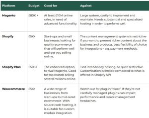
The decision to implement a product like Magento will bring cost and complexity, so it’s important to consider whether your business is the right size and shape. Our experience has been, for nearly all of our clients, that the less complex platforms can deliver all they need to grow their brands and online sales. In short, the time for Magento is when you are no longer worried about the website cost, as your business is large enough to have plenty of other things to worry about!
If you need support or guidance on what ecommerce website is right for you, we can help. Get in touch today, and we can help make a website that works for you.
Infotex’s primary base of WordPress sites are not affected by this but do check your external systems.
First developed in 1995, Java is a popular programming language that you may be using without even knowing it! All Android phones are based on the Android Runtime which is itself a derivative of Java.
Java is a very structured language known by developers for embodying Object-Oriented-Programming methods and being platform agnostic, i.e. code written in Java will run equally well on Windows, Apple’s MacOS, Android phones and a plethora of esoteric platforms.
At one point it was commonplace to embed Java “applets” into web pages, however due to the power of Java this was found to be a very risky practice and modern browsers do not permit this.
In computing most systems output status updates for diagnostic purposes, some systems make these available to users while others hide them from public scrutiny by writing to logs thus allowing developers to understand what went on when something failed.
Log4J is a utility overseen by the well known Apache Foundation which is coded in Java and is designed to process log requests either from Java applications or third parties and can apply a raft of highly complex rules to understand when a status update is routine vs. critical in nature.
Because it is so powerful yet easy to configure, this has been used in a wide variety of purposes, both bundled with Java systems and deployed to process logs from other systems (one example might be to take web server logs and promptly raise a support ticket when certain classes of error occur).
There is a highly publicised bug in Log4j from version 2.0-beta9 – 2.14.1 which is technically known as CVE-2021-44228 but more commonly by the nickname “Log4Shell”.
This was announced on 9th Dec 2021 before its maintainers were even aware of it, it appears attackers had been taking advantage of it for at least a week prior and as such is given the “Zero-day” moniker and scores the highest possible severity rating of 10/10.
Basically, on systems not configured with formatMsgNoLookups, the vulnerability allowed an attacker to create a request which would be processed by Java’s Naming & Directory Interface (JNDI) and would cause the server to make an external request and potentially execute code provided by a third-party attacker. That’s about as bad as things can get when a system is intended to process logs that anyone can initiate in web scenarios.
There are already reports of attackers using this bug to run bitcoin miners earning money for the attacker on afflicted servers.
Fixes were provided by log4j’s maintainers in version 2.15 with a subsequent release to more fully disable potential attack vectors in 2.16.
The US Cybersecurity and Infrastructure Security Agency (CISA) estimates that there are hundreds of millions of devices that are (or were) vulnerable to Log4Shell.
Infotex’s core online platform is WordPress which runs on a PHP platform and none of our log processors run log4j, nor do our client servers have Java installed.
As such our primary base of client sites are not affected.
Since the news of this vulnerability broke on Friday our team reached out to a number of specialist suppliers who offer services (e.g. custom search facilities) to specific clients which could be impacted and have received confirmation from those suppliers that fixes are being, or have already been deployed.
We have also evaluated a number of tools that we use internally (Log4j is also in use on some desktop utilities although the window of opportunity for an attacker there is minute as those systems are not available for attack online) and we have installed updates where applicable for these tools.
We frequently recommend Cloudflare as a security & performance option to clients and it is worth noting that any websites with Cloudflare’s WAF deployed were protected from attack soon after news of this issue broke as they enabled an emergency firewall rule to block potential exploits.
If your website is managed and hosted by Infotex then the likelihood is that you do not need to take any action. If you have websites hosted by anyone else, then you will need to check with those respective hosts to clarify their position. You should also check that you do not have any vulnerable installations of Log4j on your desktop or devices within your business, as it can be utilised in desktop programs.
There are several resources online trying to pull together software vendors statements clarifying whether any updates are needed etc.
One such list can be found at: https://gist.github.com/SwitHak/b66db3a06c2955a9cb71a8718970c592
Keeping your computers and website safe is a constantly evolving challenge and requires co-operation from all parties and this demonstrates the need to know who provides what and ensure that they are managing those systems effectively.
We have collaborated with Suffolk GP Federation to design and deliver a brand new system, designed exclusively for Podiatrists in order to:
This past week, the team travelled to Liverpool to officially bring the new self referral platform to market at the Royal College of Podiatry conference, held at the legendary ACC Liverpool venue. This gave us an excellent opportunity to engage with potential buyers, and users to further strengthen the system.
The College of Podiatry conference is the largest of its kind in Europe and we showcased our exciting new system, designed to improve outcomes and support the patient pathway as well as deliver practical help for clinicians.
While there, we offered live demonstrations of the platform, both the administrative back end including how clinicians could tailor the system to their specific particular practice and also the pathway through which the patient is guided.
“This system enables those with the greatest medical need to access podiatrists with the right skillset to give the best care for that patient. All the while reducing the number of wasted hours, improving patient outcomes and giving the patient agency over their own care pathway. This makes life easier for GPs, Podiatrists and most importantly patients.
The brilliance is in how adaptable this is. The different elements can be customised to then suit the needs of the service. During the pandemic Suffolk GP Fed had to drastically change how we handled our podiatry caseload. Despite everything we were still in a position to give advice and support to new patients, and focus our resources on saving the limbs of those most in need all thanks to our referral system.”
Philip Holloway – Podiatrist / Suffolk GP Federation
We also ran a prize draw in which entrants had to guess the right answer to a footie question! Overall, it was an excellent show and the podiatry community are a fantastic bunch to be around.
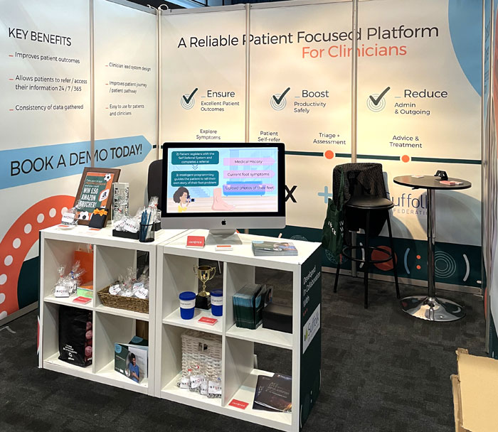
Though created specifically for Suffolk GP Federation and podiatrists, the bones of the system offer a very solid and exceptionally efficient pathway for any customer or patient type via full end to end onboarding, assessment, appointment scheduling and appropriate advice.
It is a clinician lead system design, and can be adjusted exactly as required. All outcomes are based on carefully planned question sets which you can alter to support your clients and practice behaviours.
Please contact the team to book a demo.
The year is 1991, Operation Desert Storm is in full swing in Iraq, the Soviet Union is being dissolved, the Channel Tunnel has yet to open, and Tim Berners-Lee announces the World Wide Web project.
Against this background a computer science student studying at the University of Helsinki, Finland, called Linus Benedict Torvalds posts to a NNTP usergroup (a precursor to web forums) on 25th August 1991:
“Hello everybody out there using minix –
I’m doing a (free) operating system (just a hobby, won’t be big and professional like gnu) for 386(486) AT clones. This has been brewing since april, and is starting to get ready. I’d like any feedback on things people like/dislike in minix, as my OS resembles it somewhat (same physical layout of the file-system (due to practical reasons) among other things).
I’ve currently ported bash(1.08) and gcc(1.40), and things seem to work. This implies that I’ll get something practical within a few months, and I’d like to know what features most people would want. Any suggestions are welcome, but I won’t promise I’ll implement them 🙂
Linus (torvalds@kruuna.helsinki.fi)
PS. Yes – it’s free of any minix code, and it has a multi-threaded fs. It is NOT portable (uses 386 task switching etc), and it probably never will support anything other than AT-harddisks, as that’s all I have :-(.”
His new Operating System was initially only permitted for use on hobby machines with restrictions against use in commercial environments.

Oh, how the world has changed beyond Linus’s wildest dreams!
Fortunately in the last 30 years, Iraq has returned to a relative peace, the Channel Tunnel has come to take around 1/3rd of the passengers travelling from Dover to France, the World Wide Web project can be considered a success with around 2 billion sites now online, and Linus has relented to allow commercial activity based on his operating system!
His “hobby” operating system has now become “big and professional” itself, powering the majority of websites in use in 2021.
In 1996 Linus Torvalds proposed a contest to design a logo for this new operating system, which he suggested resemble a penguin “stuffed to its brim with herring”. Thus a black, white and yellow penguin designed by Larry Ewing came to symbolize the operating system and was subsequently named Tux (purportedly standing for Torvalds Uni-X).

Linux is open-source software meaning that anyone can download the entire source code from www.kernel.org and anyone who has created an account can propose amendments to the operating system, which is one reason it has been so successful.
The size of the code has increased significantly over time, from the mere 7,400 lines of ‘C’ code in version 0.11 to around 17 million lines of code in the current version, yet the structure of the two codebases is very similar. All the additional code is there to incorporate features such as native containerisation, virtualisation support, and the ability to run on an amazingly wide range of hardware.
Linus himself still plays a major role in the direction that Linux takes. Given the size of the project and the number of contributors, there are several managers who oversee specific areas of development, but anything outside of that requires Linus’s approval, even today.
Where Linux differs from its competitors such as Microsoft Windows is that it requires such low levels of system resource (CPU / memory etc.) so it can run in a wide variety of systems – including TV’s, car dashboards, even household fridges! It is also more stable than most other alternatives, with servers rarely needing a restart except for the installation of security updates – try running Windows 10 for a year without rebooting!
Infotex has been running various versions of Linux on the majority of our web servers for more than 20 years, and some of our staff use it on their desktop computer as well.
We’ll be raising a glass to Linux on the 25th August to celebrate Tux reaching its 30th birthday, and we look forward to celebrating many more years to come. Few would have guessed where Linus’s little hobby from 30 years ago would be today and it’s hard to imagine what the world, especially computing, will be like in another 30 years time!
Discover how our team can help you on your journey.
Talk to us today