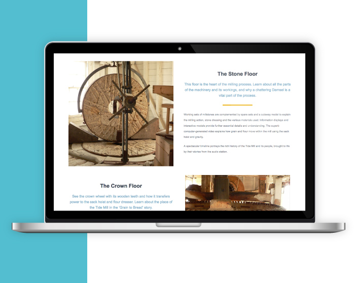
Situated on the banks of the Deben, the Woodbridge Tide Mill has been harnessing the power of the river for over 800 years. Continuing to mill to this day, it is ranked as the number 1 thing to do in Woodbridge (TripAdvisor) and required an updateable website to entice and educate potential visitors.
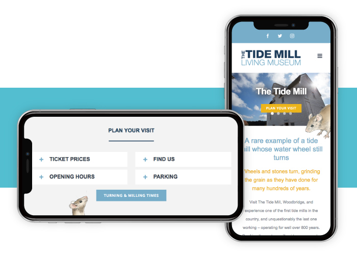
Using the existing branding we incorporated a bright and bold website, that’s easy to navigate to make sure information is quickly found. Key information is available on every page, and details such as the Tide Mill Mouse and a flowing “swoosh” sets the design of the site apart.
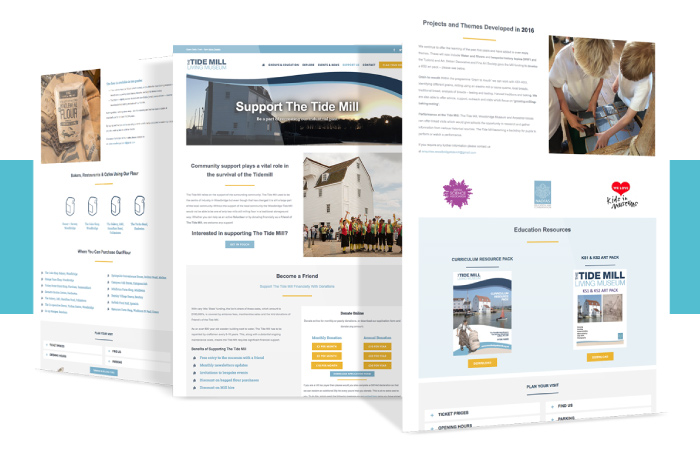
The Tide Mill is a charity and receives little state funding, so the majority of upkeep costs are provided by the community and friends. We advised on using GoCardless which allows for cost effective regular repeat donations automatically, alleviating administration and complex paperwork. The site also invites people to be a volunteer, with milling roles through to PR and fund raising positions available.
Infotex have been delighted to support the Tide Mill, and look forward to many more years of milling and turning.
Why not take a look woodbridgetidemill.org.uk
Great photography boosts website appeal in the commercial construction industry. A varied assortment of our favourites follows:
ANDERSON

Some great photography and moody atmospherics helps give the site a dramatic intrigue and a certain magnetic appeal.
BALFOUR BEATTY

A really good showcase of global projects making Balfour Beatty a powerhouse when it comes to international infrastructure operations.
BECHTEL

A superior website from one of the most respected engineering, construction and project management companies in the world. A pictorial feast of engineering wizardry.
GRAHAM

A vast array of impressive infrastructure projects throughout the UK. The showcase menu is structured well and easy to read – a nice touch with each project swapping around when scrolling across the sub headings in each category.
KIER

A fun vector graphic used as a footer showing in simplistic form of some of the services that Kier provide from construction and property development to facilities management and project investments.
MASTERSON HOLDINGS

The use of a concrete image for the background makes for a very masculine website and in the words of the Ronseal ads ‘does exactly what it says on the tin’ – after all the company are reinforced concrete and groundwork specialists.
MORGAN SINDALL GROUP

The triangular grid background of this website forms a good basis for the geometric shapes of the imagery and text panels to work together. The movement of these layers shifting independently when scrolling down gives extra appeal to the browsing experience.
RG CARTER

www.rgcarter-construction.co.uk
A straight forward layout design making the navigability very easy especially for the uninitiated.
SHERRI BUILDERS

Very professional imagery used made all the more interesting with the way that each image emerges into view giving the site a more dynamic feel.
WILLMOTT DIXON

A visual treat showing full width photography for the greater impact emphasizing WD’s commitment to being proud of their chosen industry and in particular their achievements.
If you’re interested updating your web design or digital marketing strategy, then get in touch with us today!
Every business needs a website, but designing a good website is a complicated business which many people get wrong.
Here is a list of helpful hints to ensure that your web design is exactly what your business needs:

You need to keep your layout simple and uncluttered. If you don’t, your customers will feel overwhelmed and will quickly switch off from your message.

Yes, your brand might have a distinctive colour scheme, but don’t plaster fluorescent colours across your website. No one will stick around to read your site if the background hurts their eyes. This mistake is often compounded by font colours that make reading the text difficult.
Failing to provide a contact number and an email address, or making the information so difficult to find that it might as well not be there is a trap some surprisingly big companies fall into. Don’t let your business be one of them.

Thankfully, this trend seems to be dying out. Even if you have the most original jingle ever, your website is not the place to broadcast it. Adding music to your site makes it take longer to load and will usually irritate more customers than it amuses.

While the layout of your site will make perfect sense to you, test it on people not directly involved in your business before you go live. Your web design needs to make logical sense, or your customers will get bored and find someone else very quickly.

More and more people use their mobiles to access websites. If your site isn’t optimised to take advantage of this trend, your web design will be letting you down in a really big way.

If your website hasn’t been updated in years, then this needs to be looked at urgently. The internet is littered with websites for businesses which are no longer active and you absolutely must make certain that your web design doesn’t suggest your business is one of them.
For expert advice on your web design, contact us today.
If you’ve got a good idea for an offer you want to run and are thinking about launching a pay per click campaign, one thing you’re going to need to do is create an effective landing page. Without one, your PPC campaigns may fall flat meaning you could lose out on revenue. Effective landing pages put emphasis on good design and compelling content writing. Above all else, it needs to grab the visitor’s attention and compel them to complete a conversion.
If the purpose of your landing page is to get people to follow through on your offer, you need to make sure your landing page is as clutter-free as possible. Any unnecessary details will draw attention from your message. If the landing page’s sole goal is to make your visitors convert then do what it takes to make their journey to conversion as easy as possible. If, for example, they need to fill out a form, ensure that you don’t have fields that aren’t needed. Strip everything down to the key elements and make sure it’s aesthetically pleasing. Good use of colour and eye-catching images have a surprisingly big impact. Studies have shown that using reds and greens work well for increasing landing page conversions, but ensure there is a good contrast between the button colour and your background.

If you have been promoting your offer well, through PPC campaigns, social media, Google AdWords and more, it’s highly likely that you’ll be receiving traffic from plenty of sources. Think seriously about customising your landing page for different audiences. It’s possible that a customer that has come to the landing page through Facebook knows a lot less about your offer than someone who is responding to a link in your email marketing campaign.

If your pay per click advertisements are driving your landing page, you’ll want to make sure that your copy is consistent. Repeating language and phrases that are in your PPC ads on your landing page helps to reinforce your message and adds to customer confidence. You need to be making sure that your page matches the advertisements as closely as possible. If your advertisement is about a specific product such as a pair of trainers, don’t send them to the sports clothing section – send them directly to the product they’re interested in.
For more information about how to create an effective landing page, contact the friendly team at Infotex today.
Here at Infotex, we aim to offer the widest possible spectrum of digital marketing services.
You are probably already aware that we offer help with both website design and email marketing, for example. But did you know that certain website design techniques can be applied to marketing emails to improve the chances of recipients responding positively? While an email has a very different format to a website, they both need to be visually appealing and useful in order to succeed. Ergo, the techniques that are used to create one can often be applied to the other. In today’s blog, we’ll look at the website design techniques and strategies that can be deployed in your best email marketing campaigns.

Black-and-white textual emails are suitable for ordinary communication, but they aren’t very well adapted for marketing. In order to grab your recipients’ interest, you should utilise colour, just as you would on your website. Adding colourful, visual elements to your emails makes them more aesthetically engaging and encourages recipients to devote more time to reading them. What’s more, you can deploy the colours that you use across your business to reinforce your brand.

In addition to deploying an attractive colour scheme, you should also consider using images in your marketing emails. Images are very effective at drawing recipients in simply because, when people see an image, they instinctively want to understand what it’s about. An image can intrigue a viewer by making them consider its context. Including images on a web-page encourages visitors to read the text. Similarly, including them in an email increases the likelihood that it will be read thoroughly.

An important part of designing a website is ensuring that your viewers don’t become overwhelmed by data. Every well-designed website utilises areas of white-space so that viewers aren’t confronted with a solid wall of text and images. Emails should use white-space in the same way. Nobody wants to open a marketing email and see a solid block of text or images, so give your recipients some breathing room. This will make it easier for them to absorb your email’s contents and may encourage them to act on what they read.
If you need further assistance with either website design or email marketing, get in touch with us today. We’re always eager to help.
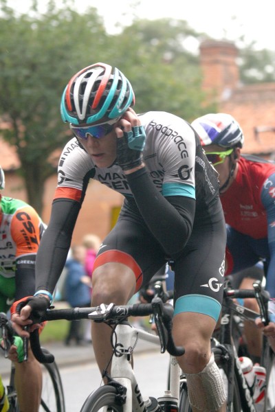
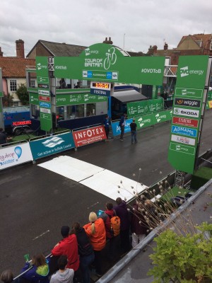
On the 8th of September 2017, the race speeds through our county of Suffolk, from Newmarket to the finish line in Aldeburgh. We have always loved the race at Infotex – the cyclists pass our offices and last year for the Women’s Tour we were out on the road cheering them on.
This year in 2017, we had the chance to get closer to the event, and become even more of a participant. Suffolk Coastal District Council, together with the fantastic marketing company The Bridge, approached us to become a sponsor of their Taste of the Tour campaign, a campaign which supports the Tour itself by engaging with the community and local businesses through bike trails, family activities, and encouraging local food businesses to give a ‘taste of the tour’ by coming up with menu specials and special events.
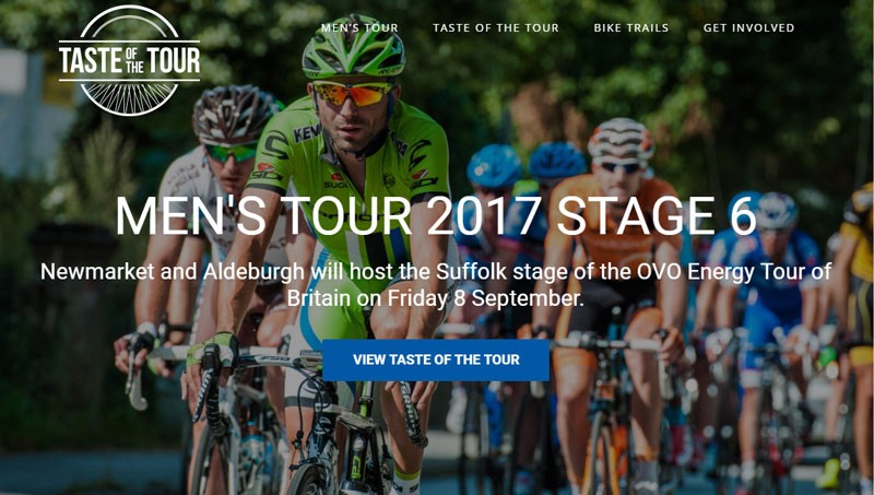
Infotex is always keen to contribute to events that benefit the local community, especially an event such as this which promotes local business, family activity, wellbeing and engagement. Through consulting with Suffolk Coastal District Council we were delighted to be offered the opportunity to produce a unique logo for The Taste of the Tour, and building them a website which encourages engagement and participation in the campaign.
Our design team worked on a logo that incorporated the spokes of a bike within a strong stamp brand, and created a website with stunning visual scenes of our beautiful local area, together with clear information on local activities and events.
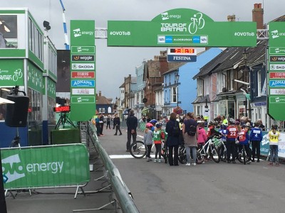
It was really pleasing to see the momentum grow with the Taste of the Tour, with more companies joining up to take part along the way. The culmination, of being at the finish line waiting for the cyclists to hurtle through the High Street of Aldeburgh, felt truly exciting. The kids from the local primary in Aldeburgh had their own mini race which was really delightful. People from the whole area were lining the streets – whole area was buzzing with excitement.
We were so pleased to be working with Suffolk Coastal District Council on Taste of the Tour, and we look forward to going on Tour next year! We are also please that they delighted with the results [get quote], and we look forward to working with them in subsequent years to build and celebrate the Tour of Britain with The Taste of the Tour campaign.
Cllr TJ Haworth-Culf, cabinet member for Customers, Communities and Leisure, said:
“Thank you to Infotex for putting their hard work and creativity into the Taste of the Tour website.
“The platform allowed us to promote the OVO Energy Tour of Britain in an exciting way and to encourage more people to get involved with the international cycling event.
“We’ve had some great feedback from families taking part in the bike trails and we hope we can build on this success as cycling continues to grow in Suffolk Coastal.”

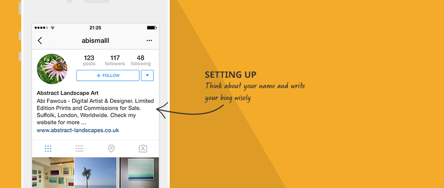
I already had an account with around 29 followers (pretty meagre). But if you haven’t you need to download the app onto your phone and set up an account. To aid being found I recommend both your username (known as a handle with the @ sign) and your name having reference to what you do in it. For example I set my name as Abstract Landscape Artist. You are then more likely to come up in a search of your your specialism.
Write your biography wisely and link to a relevant page on your website in the URL (web address) field. This is the only small area you have to promote what you do and direct people away from Instagram.
Then choose the amount of times you think you can feasibly post each day and get started. I went with one but three is optimal.
Your pictures need to be good. Look around, there is a very ‘glossy’ magazine feel to Instagram. It is also starting to be more common to see the animated gifs or video loop images offered by new smart phones.
Friendly and kind. This is not twitter.
People are more reserved about who they follow than on other social platforms, they are much more likely to ‘like’ than give you a full resounding follow.
Etiquette seems to suggest you should have more followers than be following.
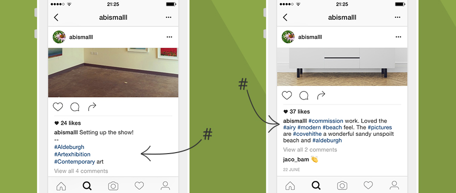
Make sure you use the hashtag (#) in each post.
The only way for you to reach those outside your own following is including a hashtag they may be interested in. Think clearly about what subjects your audience would look at and make sure that your hashtag includes:
Six hash tags is about right. if you want to set your hashtags away from your post text, you will often see people use ‘–’
For example;
This is the text for my insta-post
—
#hashtags #subject #location #etc
You can indeed increase your following by good old fashioned hard work.
Quite excited I surfed around on Instagram looking at people trending on hashtags similar to the ones I was using. I commented on their pictures and in return got some nice comments back, a few likes and some thank yous but not really any follows.
I checked out the ‘settings’ tab on my instagram and under ‘Find & Invite Friends’ trawled my contacts stalking anyone I had ever known – and followed – with not that much response.
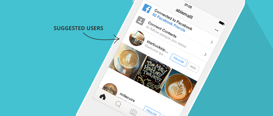
Then I looked at ‘Suggested Users’ and, being a little more sensitive here, I liked or commented on their images and then followed. The response was good, better than my real friends! I got quite a few follows back and increasing likes.
So I now knew that if I made the effort to look, comment and then follow I was more likely to get people taking the time to look at me and follow, but more often it started in lots of likes. I found if I checked the ‘grammers’ that had left likes (but no follow) commented or posted on their feed, then followed them I was getting a higher rate of follow returns.
I also noticed that my activity and engagement was snowballing I was reaching wider and growing likes, comments and follows.
Next I checked how my time of day was affecting numbers.
Currently I was posting at 9pm so I tried at 7am and 12pm. The numbers were considerable; midday doubling and early morning tripling so I moved my daily post to 7am.
Small trick – I also learned to cull dead followees, those I was following who were not attentive to my path to greatness.
I did some real world research.
I went about my day asking anyone I could what they thought of Instagram and how it worked for them – there are definitely industries that thrive on Instagram and I found many people and small businesses for whom Instagram is a brilliant marketing tool bringing them many sales. These industries are generally fashion, food, lifestyle and outdoor adventure.
So what if you aren’t in one of those industries?
In one word….Keywords.
#Hashtags are key but tagging just for ‘your’ industry is not a way to approach a wider audience so I started #ing the industries that worked. Adding #interiors #interiordesign #womensfitness #wheretonext and apparently blueberries and donuts do wonders for likes too, but no, even I had a limit to how low I would stoop. That said using the hashtags from popular industries definately increased likes which in turn after I had engaged, cultivated follows.
You can see a few popular hashtags in this article; www.postplanner.com/best-instagram-hashtags
So numbers were growing, this was great wasn’t it?
Now I just focused on those liking my posts. I checked them out, liked, commented and followed. This showing of interest in them over just following increased my follows, but as this grew as did my time responding and although I discovered new, nice and interesting stuff it was taking up my time which should have been spent doing actual work.
‘I wasn’t doing this out of enjoyment but for the benefit of my business’
Unlike pinterest where I surf just to find ephemera and inspiration I wasn’t doing this out of enjoyment but for the benefit of my business, this is very different from using a social platform for social or personal purposes. So was the return on investment enough for the time (and therefore money) I was spending?
I was pleased, I had more than tripled my following and it was easy to see that this was a snowballing effect. As I continued posting and tagging once a day, my numbers were growing at a much quicker rate than the virtually ‘zero’ movement before this experiment.
There is no doubt that Instagram, and all the other social media platforms help build very successful businesses, however choose wisely, test, decide, create a strategy and importantly – stick to it. Even those that have millions of followers all say it is hard work, and just posting with the odd hashtag and sitting back and waiting will not bring you riches.
With 300 million active daily users on instagram yes that means you have a far reaching pool but it also means you have a big ocean to navigate through, with your lone voice needing to rise above other – dare I say – natives, and many millions of those are of course not interested in your line of business.
Yes and no. Social media is not a magic wand but if you choose your social media platform carefully, have a strategy and a campaign – and stick to it – it is likely to work. But sporadic posting across random platforms is less likely to help your business and more likely waste you time.
Stats on conversion rates seem to vary considerably but most say social platforms are around or below 1% with newsletters being much higher than that so finding the right platform and finding the right person (not everyone has the knack) is an expense that needs to be factored in. In the end, social marketing is no different from traditional marketing, find what suites you and stick to it, routinely making sure the return is worth the outlay.
You can find a large selection of stats here if you want to know more: www.expandedramblings.com/
And finally, if any of these alarm bells have rung for you and finding the right marketing avenue to turn down is on your mind why not give us a call.
All our advice is born out of hands on experience and delivered with unbiased recommendation.
The golden arches in any country gives me a craving for chocolate milkshake, a small apple with a bite taken out of it implies luxury technology and a mulberry tree makes me want to sell my husband just to get my hands on a leather bag!
The past couple of years have seen a number of brands alter their logo and 2015 saw the Infotex logo evolve and develop (more on this from our Design Director Abi Fawcus next month). But why did these companies change their already well-known brand symbol?:
1. TO ADAPT TO A CHANGING MARKET:
This year we saw the Google logo had its biggest redesign since 1999. The change was based upon how people react to Google across “many different platforms, apps and devices.”1 The typeface of the new logo is ‘product sans’ which combines “the mathematical purity of geometric forms with the childlike simplicity of schoolbook letter printing”. The renowned four colour is seen across the brand even featuring in the microphone design when using voice controls on your mobile.


Thetrainline.com has also adapted to the mobile market by changing their name to simply Trainline. They launched a new mobile app to illustrate their new brand concept of ‘Smarter Journeys’, with the CEO Clare Gilmartin stating that their “mission is to help people travel smarter, and by using their phones they can enjoy the advantages of saving money by buying in advance and ensuring they have real time travel updates during their journey.”2 The #IAmTrain campaign was also launched to promote the change with a heavy emphasis on using social media to promote the new mobile friendly brand.

2. IN RESPONSE TO A MAJOR CHANGE IN THE COMPANY:
Pizzahut has recently redesigned their logo in response the their biggest menu change in years. Dubbed as the ‘Flavour of Now’ this new menu is seen as a response to their recent stagnation in the market and this logo change is used to help the transition. The Vice President of Marketing commented that “Any good flavorful pizza starts with a sauce swirl”3 which is what inspired the red swirl on the edge of the logo.
3. TO PROMOTE A NEW BRAND IDENTITY:
Airbnb completely changed their brand positioning in 2014 by promoting the sense that their customers can ‘belong’ in any of the properties rented through their website. They introduced their “Bélo” logo – “It’s an iconic mark for our windows, our doors, and our shared values. It’s a symbol that, like us, can belong wherever it happens to be”4

4. A BAD RESPONSE TO A LOGO DESIGN?
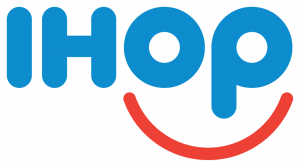
American restaurant giant IHOP (International House of Pancakes) changed their logo for the first time in decades this year. They have simplified the logo but the most major change is the red line below IHOP from a downward to an upward curve. According to the company’s Vice President of Marketing, the old logo “appeared as a person’s frown.”5 Instead he believes that the new and more positive logo will be more attractive to customers and “make them smile.”
5. FOR THE SAKE OF CHANGE?
Facebook have made very slight alterations to their logo using a custom typeface to “modernise the logo to make it feel more friendly and approachable”6 (Josh Higgins, Facebook’s creative director). The most noticeable change is the “a” which is fuller and rounder.


1 Evolving the Google Identity
2. thetrainline.com Rebrands itself to Trainline
3 Inside the Pizza Hut’s Saucy Rebranding
5 IHOP Changed its Logo, says the old one looked like a frown
6. Facebook unveils new logo in stunning change for fans of the letter A
What is this?
In the advent of powerful off the shelf platforms such as WordPress, Shopify or Magento, the cost of buying a website for many businesses has been considerably reduced. This is great news. Never missing an opportunity designers and coders of all abilities have started designing templates to accommodate most types of businesses on these platforms.
Well that’s great isn’t it?
These themes look beautiful as the designer has perceived them but they don’t always look so good once your business has been shoehorned into it. Nor do you ever quite know what is under the lid; leading in some cases to problems with updating platform software or browser compatibility.
What does it mean for me?
Understanding your requirements and constraints and offering you the best solution or sharing with you the options is core to how we work. There is no doubt that done properly themes can save you time and money. So we have hand-picked a selection of themes and use them as building blocks to create a website that will fit you but is guaranteed by us.
Here is a quick check list to give you an idea of whether a pre-built or custom theme would work best for you.
A pre-designed theme is great if:
A pre-designed theme is not so great if:
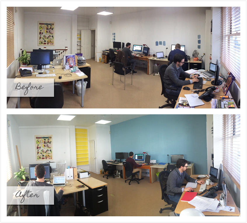
Infotex are currently undergoing some redesigns to the interiors of both the Melton and London offices, which has prompted a lot of thought lately behind what really makes a great office interior.
Acknowledging these three simple guides can help ensure that the right atmosphere is being established in the office: Function, Mood and Personality. The function of the office is vital for everyday running, ensuring that employees are making the most of the space and facilities provided.
Creating the right mood is imperative to guarantee that people are working in a relaxing and productive environment, which will reflect in the way they work. Finally personality should be injected into the design of the office. This is your chance to have some fun and really showcase the ethos and character of the company and it’s branding.
Lack of natural light can have negative impacts on mood and productivity. Natural light is a much-overlooked benefit in office design, but it should be one of your major considerations in office design and layout.
An office space requires fresh and clear lighting to brighten up the room, especially on dull winter days when people may be feeling sluggish. Upgrading your lighting is a cost effective way to give the office a lift and boost moral. Taking into account the function of the room will be a huge driving factor for what type of lighting you get and where it should be placed.
For example in a room such as a meeting room where presentations will be held, it is advised that dimmer switches are added to allow people to control the level of lighting. The addition of desk lamps is also a great way for employees to control their own level of lighting around their own working space.
Colour is something that will massively affect the atmosphere of the office. Bright and vivid colours will give a sense of energy to areas of the office, whilst dark and dull colours will create a more somber feel.
Certain spaces in the office may require a more calm and soothing colour scheme, depending on what the area is being used for. Most importantly it is vital to ensure that the design is in keeping with the branding and personality of the company.
Every office comprises of two very important items of furniture… the desk and chair. These are the two most important things to consider whilst kitting out your office.
The ergonomic design of every desk and chair should be taken into account, ensuring maximum comfort and support is being provided to employees for those long working days.
Those simple finishing touches are what will really complete the design and pull the whole project together.
Adding greenery to the office is a great way to bring the outdoors in and add some life to your office space. By using standing plants as well as small desk plants you can inject more colour into the office and significantly freshen up the room.
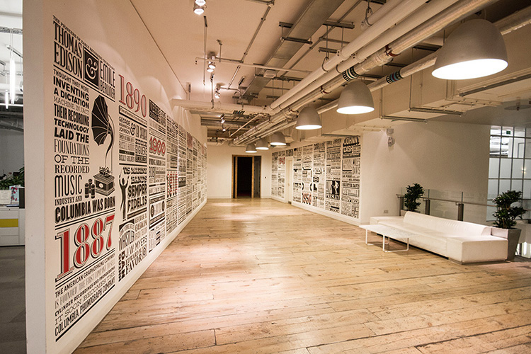
Hanging artwork will ensure that the walls aren’t left looking bare and empty. This is a great opportunity for you to incorporate some of your company’s accomplishments into the design. By introducing case study posters into the office you will not only be adding a sense of design and creativity to the office, but it is also a brilliant way to showcase what your company stands for and any key information and ideas that are significant to the ethos of the company. A prime example of this are the wall murals created for Sony Music by The Graphic History Company
http://theghc.co/page.php?id=projects
The work area in the office should be flexible and dynamic, encouraging the productivity of workers.
Creating breakout spaces allows employees room away from their desks where the can go to be creative or just somewhere where they can relax and eat lunch. Introducing hot desks in a quiet part of the office means that people have a private and secluded place to work if they need space or a bit of peace and quiet. This allows employees to focus on their work without any distraction.
It is not only important to create a productive working atmosphere in the office for the employees, but it is also vital that you are aware of how you come across to clients.
Branding the office should be just as important as branding your stationary. The complete brand identity of the company should be carried throughout the whole of the office design; any ideas and colours should be embedded into the design of the office making sure that the right message is being sent across.
Discover how our team can help you on your journey.
Talk to us today